Splinterlands: New Card Selection UX, Seeking Opponent and Battle Rules screen. Better optimized for mobile gaming, harder to rearrange cards on desktop though. (February 2025)
Neue Karten-Auswahl-UI "Select Units", "Seeking Opponent" und "Match Rules"-Anzeige. Großes UX-Design-Update.
Splinterlands hat vor ein paar Tagen ein weiteres UX-Update durchgeführt und jetzt auch die Karten-Auswahl modernisiert.
Das Update soll die Spielbarkeit von Splinterlands auf mobilen Geräten deutlich verbessern, sorgt aber in der gewohnten Desktop-Version zumindest anfänglich für etwas Verwirrung.
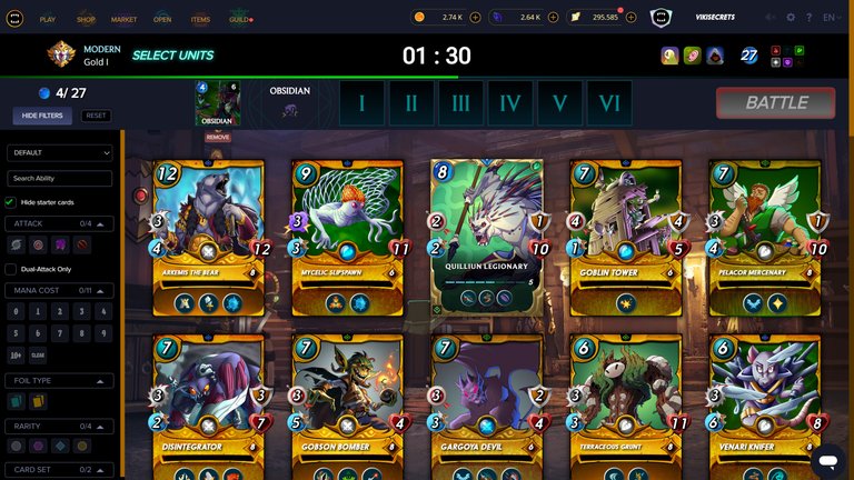
Die Filter befinden sich jetzt in der Desktop-Version auf der linken Seite und die Karten, die man auswählt, werden relativ klein am oberen Rand angezeigt. Es ist jetzt schwieriger geworden, die Karten zu verschieben, das funktioniert irgendwie nicht so richtig, und auch die Match-Rule-Anzeige ist in der Desktop-Version ziemlich klein ausgefallen, die Match-Rule-Symbole teilweise auf kleineren Geräten (Tablets) schwerer zu erkennen.
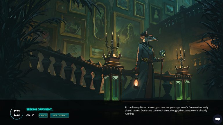
Auch der Seeking Opponent-Bildschirm wurde aktualisiert und zeigt jetzt ein cooles, bildschirm-füllendes Splinterlands-Art-Wallpaper, das sich auch bei jedem Match ändert.
Auch die Match-Rule-Anzeige wurde umgestellt und auf die neue Design-Sprache angepasst.
Was gefällt euch das Update? Habt ihr euch schon daran gewöhnt?
Splinterlands UX Update: Seeking Opponent, Battle Rules and Select Units screen updated (February 2025)
Seeking opponent

Battle rules
Select units
https://x.com/vikisecretscom/status/1892890780747874326
English
New card selection "Select Units" UI , “Seeking Opponent” and “Match Rules” screen. Major UX design update.
Splinterlands carried out another UX update a few days ago and has now also modernized the card selection.
The update is intended to significantly improve the playability of Splinterlands on mobile devices, but is causing some confusion in the familiar desktop version, at least initially.
The filters are now on the left-hand side in the desktop version and the cards you select are displayed relatively small at the top. It is now more difficult to move the cards around, somehow it doesn't work properly, and the match rule display is also quite small in the desktop version, the match rule symbols are somewhat more difficult to recognize on smaller devices (tablets).
The Seeking Opponent screen has also been updated and now shows a cool, full-screen Splinterlands artwork wallpaper that changes with every match.
The match rule display has also been changed and adapted to the new design language.
How do you like update? Have you already gotten used to it?
Posted Using INLEO
!LUV
@vikisecrets, @valggav(1/1) sent you LUV. | tools | discord | community | HiveWiki | <>< daily
Thanks for sharing! - @yonilkar

!BBH
!PIZZA
Rearranging cards can be an issue, but I found the solution to it. Just scroll the cards up to the top. After putting all your cards, scroll up to the top of the card selection area, then rearrange the cards in your lineup. I found that solution after playing around for a bit. It seems to mess up on rearranging cards if you don't have that specifically.
Also noticed that, dragging items on the edge of the page makes the page scroll, which interferes with the rearrange mechanism.
Gewöhnt habe ich mich noch nicht daran, aber ich finde es nicht schlecht. Am Handy ist es allerdings etwas zu überladen. Dafür mag ich die neuen Ladescreens und dass man andere Dinge machen kann, während man ein Battle sucht.
I hope another change doesn't come before I get used to this.
!HBITS
Success! @krakonos(2/1) You mined .9 🟧 HBIT and the user you replied to received .1 HBIT on your behalf. You can receive 100% of the HBIT by replying to one of your own posts or comments. When you mine HBIT, you're also playing the Wusang: Isle of Blaq game. 🏴☠️
Sorry, but you didn't find a bonus treasure token today. Try again tomorrow...they're out there! You can see your random number generated in the Discord server, #hbit-wusang-log channel. | tools | wallet | discord | community | daily <><
There is a treasure chest of bitcoin sats hidden in the game. Someone will find it. Happy hunting. 😃
Check for bonus treasure tokens by entering your username at a block explorer explorer A, explorer B, or take a look at your wallet. Read about Hivebits (HBIT) or read the story of Wusang: Isle of Blaq
I really love how the new update looks!
!BBH
I've seen complains on the mobile version rather than on desktop. I am not a huge fan, but it seems working for me.
I tried it on mobile and it's horrible, you can just see 3 cards when choosing team and it's so annoying when you have a lot, also switching positions is often bugged
!PIZZA
War schon wochen nicht mehr drinnen, vielleicht schaue ich wiedermal nach.
!BEER
Am Anfang ungewohnt bis mann sich wieder zhurecht findet wo was ist
Das Update ist zuerst etwas ungewohnt. Vor allem finde ich die Karten auf dem Tablet etwas zu klein dargestellt. Werde mich aber daran gewöhnen.
To me, it's the other way around. I played my Brawls on desktop and I didn't have any issues, other than having to get used to it. On mobile is where I'm having problems because it's such a small window for the cards. The part that has the summoner, units and mana spent takes up too much space. It should be all together and the mana thing can go to the above bar. It's not necessary to have 1 total mana cap thing and another with mana spent/mana cap.
Definitely will take me some time to get used to it. Also 100% agree with the positioning of the cards. I think it's quite a struggle at the moment on desktop. Hopefully they'll fix that soon.
Otherwise I think the new design looks quite good.
I really like that the new seeking opponent overlay can be hidden, so you can do other things while waiting for a match.
I think I figured out the problem with the positioning of the cards, it interferes with scrolling the page, in order to reposition the cards the page has to be scrolled to the top. Hope this will get fixed.
I like the update. It seems that they are preparing some kind of release. We will see if they recover the splendor of the past.
$PIZZA slices delivered:
@bitandi(1/5) tipped @vikisecrets
davideownzall tipped vikisecrets
View or trade
BEER.Hey @vikisecrets, here is a little bit of
BEERfrom @thehockeyfan-at for you. Enjoy it!Learn how to earn FREE BEER each day by staking your
BEER.Yeah I found the new update on the visuals very great and more convenient to play through
Delegate Tokens and HP to Fallen Angels to earn weekly rewards!
Delegate | Join to the guild
It looks pretty nice and neat to me
The update makes the game easier to use on the mobile
wow, some good updates.. I like the organization. 😉😎🤙
This is actually great
Changes in games should be like this, then people are more interested again and hence we see new users coming to the game.