Splinterlands - The new design is slick, but the warm fantasy feeling vanished from it
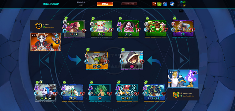
Splinterlands evolves incrementally and just today after I came home from drinking with a friend, I was surprised from a new design. I thought that I might have drink too much, but it wasn't that as the battlefield action was modernized. It took me a bit to get accustomed to it, the new design is quite slick, but in the same I felt that the warm fantasy feeling disappeared from it. Probably I am old style and I liked the previous design which had more round forms and breath mystery, fantasy, but also more like a human made creation. Probably this is subjecting, there might be other touches that could bring these emotions back to the modern format, but that's something needed to be said as I saw similar opinions from other players.

For me the new format is too clean, the lines are too straight and everything is too well positioned. It looks more formal, more neutral instead of a battlefield surrounded by chaotic, fantasy and mystery elements. The immersion was better before in my opinion and while playing the game I felt that I was transposed into another realm where you would battle mystic forces in different realms.

The battlefield looks now like a modernized arena, probably more scifi then fantasy in my opinion. There isn't anything wrong to go this way, but this is a big jump from where Splinterlands started and where it is going. Here are some of my observations on this:
- The background representing few symbols is too symmetric and it doesn't lay down a specific atmosphere for the battle to come. I prefer more chaos, more mystery, more rounded forms.
- Hovering over cards has an issue that it keeps the original position of the card and adds another one as it would have pop out; thus we see two cards of the same time overlapping, which for me looks more like a bug then an intended functionality.
- Hovering over cards present the skill tooltips in different positions, either to the left or to the right. I believe that the position should be fixed and not moving one way or the other in order to be more user friendly to the eyes.
- The transition to and from the battlefield is to abrupt. Maybe the modern format is too fast or something, but in order to immerse the player into the game I would prefer some smooth transitions and elements that prepare you for what's to come.
- Before each battle I get "It appears that there has been a delay in processing this transaction from the blockchain. Please be patient and do not submit the transaction again or it will be processed twice." Pressing OK will get me to the battlefield and I can see it unfold.

Hopefully all the above feedback is constructive and give Splinterlands team something to think about if they want to do some changes. I am a software tester at origin and I thought that providing a view on the new format could help in shaping what's too come. The game evolves and it surely needs to do so, but it is also our responsibility to provide feedback and shape how we want it to look like. A game made by the players, for the players!
Here you can Join Splinterlands as well and Fight the Good Fight: https://splinterlands.com?ref=sm-goldies
Posted Using InLeo Alpha

Delegate Tokens and HP to Fallen Angels to earn weekly rewards!
Delegate | Join to the guild
https://www.reddit.com/r/Splinterlands/comments/1gvls8a/splinterlands_the_new_design_is_slick_but_the/
The rewards earned on this comment will go directly to the people( @behiver ) sharing the post on Reddit as long as they are registered with @poshtoken. Sign up at https://hiveposh.com. Otherwise, rewards go to the author of the blog post.
Fully agree with everything... it feels a step back to me, way less fun. I found myself just skipping battles.
There are definitely some bugs to work out, and good, constructive feedback like this is just what we need!
I'm sure that the missing abilities on cards with more than 1 line of abilities will be fixed. Plus, for a new player, it is hard to see which card is doing what. Even on speed 2 there are some overlapping actions that make it difficult to follow the battle.
Speed 2 is too slow, speed 3 is too fast.
Here's to moving forward.
-Dtam
This is good feedback. Please put it in the #-ux room in the SPL Discord so they can add it to the mix.
Great to see constructive feedback! I thought the same, but I think they'll going to work on it, and maybe develop different skins to choose from was well.
@tipu curate
Upvoted 👌 (Mana: 39/49) Liquid rewards.
Here at this time the team should listen to the people what they are saying changes must be made in this game otherwise people will stop playing it too.
Thanks for sharing! - @mango-juice

The new in-match UI is really so cool!