Vue.js 3 Development - Part 3 Jest & Creating a Navigation bar

Intro
Hey everyone. So I messed up last time and was kind of tired and published before adding all the Jest unit testing setup and feel really bad for letting you all down. So today were going to go hard on creating a component and tests for it as well as how to actually configure jest with Vue and typescript support. Also since were not going to be talking .NET any longer, I will still be making things relevant to our project and showing screen shots from Visual Studio but I've decided to rename the article series going forward since the focus is going to be on Vue.js development.
Previous Articles and Code
If you haven't been following our series the previous entries can be found at
All code for this article series can be found on Github
Testing/Dev notes
- When running the site and making changes be sure to use empty cache and hard reload (requires dev tools open) when refreshing the page since were not using node dev server we don't have hot reload and need to refresh the browser. Right click on the reload button and you should see a menu with the option for Empty Cache and Hard Reload.
So why Unit test?
Unit testing. Its a love hate relationship for developers. We often write our code spending hours or days getting a feature right just to skip over or do a poor job of writing a meaningful unit test. The lack of meaningful tests is usually a good sign of a code base that is fragile and just waiting to break.
Unit testing is important because it allows us to define a 'working state' of the piece, or unit, were testing. A well written test suite, a collection of unit tests, when run as part of your development cycle and a CI/CD pipeline is a great first defense at finding issues before a breaking change makes it to QA or wore Production causing a 🔥🚒 drill and emergency bug fixes.
What is a Unit test?
A unit test is just as the name sounds a test of a single piece or unit of functionality. This can be a visual component or code such as an api or vuex testing. In addition a unit test should test only a single piece of functionality and groups of tests based on the same unit should be grouped into a test suite. In Jest this is accomplished with two helper functions, describe and it. The describe helper allows you to define your test suite while the it helper allows you to define individual tests. While you don't need to use test suites it is recommended for organizing, grouping and optimization when running lots of tests. So what does a typical test file look like?
describe('It is a test suite!', () => {
   it('Tests something', () => {
        ........
   }
})
Pretty simple right? This same test structure is used for both javascript and typescript test files. The only difference will be that tests using Typescript will enforce type safety.
Adding Jest to our project.
So there are a few steps, nothing too crazy or complex at all and in a few minutes we should have Unit testing with Jest support added to our project. Were going to need to make the following changes:
- Add some packages to
package.json - Add a
jest.config.js - Update our
babel.config.js - Add a simple test to make sure it works
Updated packages
So to get started were going to update our current package.json and add new devDependencies. For our configuration were going to need to install the following packages:
- @vue/vue3-jest - Vue 3 jest support
- @vue/test-utils - Vue.js test library
- jest - Jest testing framework
- jest-serializer-vue - Serialize vue files
- jest-transform-stub - Stub non js assets
- jest-watch-typeahead - Sort tests by filename
- ts-jest - Typescript support for jest
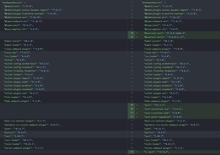
Here you can see the diff of the devDependencies after I added all packages to the config. In addition to adding these we need to add support for running the scripts so were going to add two new scripts to the script section of our package.json. The first is a script to just run the tests once, useful for CI/CD pipelines, and the other is a watch mode, which we will run in a second terminal while we develop later.
    "test": "jest",
    "test-watch": "npm run test -- --watch"
So the first command is the same as if you ran npm test on the command line while the second command will execute the first but pass the watch argument to leave tests running in an interactive watch mode so any changes we make will trigger the tests to run again. Sweet so we now have our packages and test scripts added so were ready to move on to the next step. You can see the final diff for these changes here.
Jest Configuration
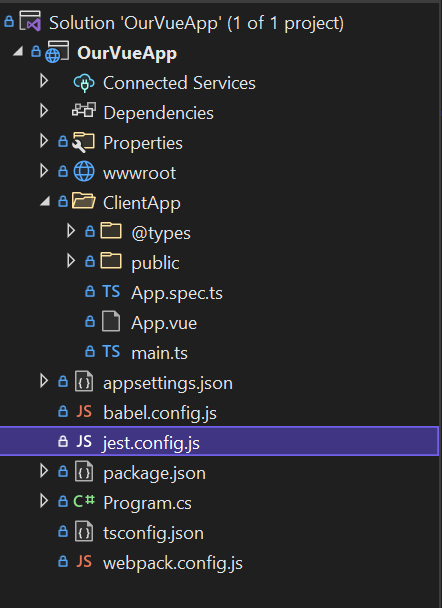
So the next step is to actually configure Jest. To do so were going to add a jest.config.js to the root of our project. After you add it the solution explorer should look like the following.
So even though were using a js file were going to be exporting a json object. Were going to add the following content to the file.
module.exports = {
    "testEnvironment": 'jsdom',
    "moduleFileExtensions": ["js", "jsx", "json", "ts", "tsx", "vue"],
    "moduleNameMapper": {
        "^@/(.*)$": "<rootDir>/ClientApp/$1",
    },
    "modulePaths": [
        "<rootDir>/ClientApp",
        "<rootDir>/ClientApp/components",
    ],
    "transform": {
        "^.+\\.js$": "<rootDir>/node_modules/babel-jest",
        ".*\\.(vue)$": "<rootDir>/node_modules/@vue/vue3-jest",
        '^.+\\.tsx?$': "<rootDir>/node_modules/ts-jest",
        '.+\\.(css|styl|less|sass|scss|jpg|jpeg|png|svg|gif|eot|otf|webp|ttf|woff|woff2|mp4|webm|wav|mp3|m4a|aac|oga|avif)$': 'jest-transform-stub'
    },
    "transformIgnorePatterns": [
        '/node_modules/',
        '/bin/',
        '/wwwrooot/'
    ],
    "snapshotSerializers": [
        "<rootDir>/node_modules/jest-serializer-vue"
    ],
    "testMatch": [
        "<rootDir>/ClientApp/**/*.spec.(js|jsx|ts|tsx)"
    ],
    "testURL": 'http://localhost/',
    "watchPlugins": [
        "jest-watch-typeahead/filename",
        "jest-watch-typeahead/testname",
    ],
    "globals": {
        'ts-jest': {
            "babelConfig": true
        }
    }
}
Whoa I thought you said this wasn't going to be complex! Its not I promise. I'm going to explain all of this and it will all make sense.
So the testEnvironment setting jsdom is very useful for developing web apps. It sets up a fake dom like environment perfect for our needs. The moduleFileExtensions as you can guess are the types of files we want Jest to possibly load for us. Next we have moduleNameMapper, is a map from regular expressions to module names that allow Jest to stub out resources, like images or styles with a single module. modulePaths is an array of paths that modules should be searched for. The transform section tells jest how to transform files, here were mapping different loaders to different resource types. The transformIgnorePatterns are mappings to things to not transform in Jest. Were not making use of the snapshotSerializers but have them configured so we can turn on snapshot testing later on. The testMatch is a regex that tells Jest how to find test files, here we told it any js, jsx, ts or tsx file named *.spec.(extension). The testUrl defines where the tests should be run. The watchPlugins section is organizing by filename and testname. And last we have a global setting for ts-jest telling it to use babel. Sweet and tats it for the config, I told you it wasn't that complex, however if you want deeper explanation or to use some of the other available options you can read through the official documentation.
Updating our Babel config
So this is going to be a short section, its actually all about adding a test env to our configuration. Were already using the js api for babel so all we need to do is add the following env definition and add it to the return object.
const env = {
    "test": {
        "presets": [
            ["@babel/preset-env"],
        ]
    }
};

return {
    env,
    presets,
    plugins,
    comments: true
};
You can view the diff here.
Sweet we now have all of our configuration done and we can get to testing!
Adding a test
So we don't really have much in our Vue.js application yet but we can add a basic test for App.vue. To get started go ahead and add a new file App.spec.ts to the root of the ClientApp so that it lives next to App.vue. Add the following code block to the file and we will break it down after.
import { mount, VueWrapper } from '@vue/test-utils'
import App from './App.vue';


describe('It tests the App.vue', () => {
    let wrapper: VueWrapper<any>;

    beforeEach(() => {
        wrapper = mount(App);
    });

    afterEach(() => {
        wrapper.unmount();
    });

    it('Tests that it renders', () => {
        expect(wrapper).not.toBeNull();

        expect(wrapper.text()).toBe('Hello from .NET');
    });
});
App.vue Test Breakdown
So whats going on? Well to start were making use of the vue testing utils library and using fluent exceptions (Mocha) which was installed with Jest. In order to test components with the test utils library we need to make use of a two exports, mount and VueWrapper. The mount utility takes a component and optional mounting props to attach the component to the jsdom and allow us to test. The VueWrapper we imported is a type and we use it so that we can declare the wrapper variable since were using typescript. If this was plain java script we wouldn't need to import the type.
So I see the describe and it functions you described earlier but whats this beforeEach and afterEach? Well those are additional helper methods that Jest provides for suites, in testing you don't want state to pass down through tests so you need to create and release the object between tests. You can see that before each test we mount the component and after we unmount it, this ensures no state is saved but also prevents memory leaks and is very important to perform.
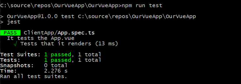
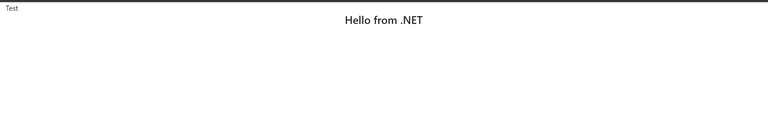
Last we have our actual test block. It 'Tests that it renders' is a pretty generic test. All were doing is expecting the wrapper to be valid and were also expecting it to contain the text message 'Hello from .NET' that we have in the page. If you go ahead and run npm run test from the command line you should see it execute and see the results that 1 test suite and 1 test passed.
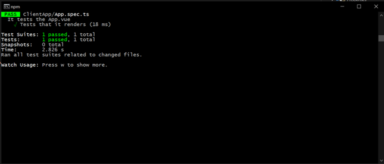
Now go ahead and cheer and celebrate because we have configured Jest with typescript support for our Vue.js application! So before we move on we need to start our tests in watch mode so on the command line or visual studio terminal go ahead and run
> npm run test-watch
This should start our unit testing in watch mode so any changes we now make will cause the tests to re run so we will see when something breaks. Your command line window or terminal should now look like the following.
Now were ready to write some components and test them!
Our first component a Navbar
So were going to start our site out by creating a navigation bar. Were going to make use of bootstrap BUT were not going to use popper.js. We will use Vue's eventing to apply the appropriate 'show' css classes as well as changing aria tags for accessibility. To get started lets go ahead and add a new folder to our project named components. Go ahead and place this as a child to the ClientApp folder. Now go ahead and add a file Navbar.vue. Whenever I start a new component I pretty much always just add a simple template such as
<template>
    <div id="navbar-component">
        <nav>
            Test
        </nav>
    </div>
</template>

<script setup lang="ts">
</script>
I do this so that 1) I can just import the component into the application, page or other component I'm working on and 2) so I can start a basic test. So now that we have a template to bootstrap lets go ahead and import it into the App.vue and place it on the page. To do so we first need to add a script section to App.vue, and our updated App.vue should look like the following.
<template>
    <div class="container-fluid">
        <navbar></navbar>
        <div class="row">
            <div class="offset-2 col-8 text-center">
                <h4>Hello from .NET</h4>
            </div>
        </div>
    </div>
</template>

<script setup lang="ts">
    import Navbar from './components/Navbar.vue';
</script>
Here you can see we added the script section with this new setup keyword. This is a new Vue 3 feature for composition api that allows you to do the setup without needing to use the setup() function and return the refs and other reactive objects. I'm not going to go into detail, you can read up about it here, but it is my preferred method of writing Vue 3. We have also indicated that our code will be typescript.
To use the Navbar component we created we now need to import it so we pull it in in our script. By default Vue will use the import name lower cased and hypenated if you use multiple capital letters on the import name. You can see we import Navbar so we use <navbar> in our template, however if we had done the following import
import NavigationBar from './components/Navbar.vue';
we would of needed to use the element name <navigation-bar>. Save the file and you should see that we have broken our unit test, whoops! So why did it break? Well when we wrote the simple test before we only had 1 string of text on the page so were able to use the text helper method on the wrapper object. Now that we have more text and going forward we will have a lot more so we should update our test to not depend on checking for the content of the page. So in App.vue go ahead and add id="app-component" onto the parent <div>, with our previous changes App.vue should now look like the following code block.
<template>
    <div id="app-component" class="container-fluid">
        <navbar></navbar>
        <div class="row">
            <div class="offset-2 col-8 text-center">
                <h4>Hello from .NET</h4>
            </div>
        </div>
    </div>
</template>

<script setup lang="ts">
    import Navbar from './components/Navbar.vue';
</script>
Great so now if we go back to our App.spec.ts we can go ahead and delete the line expect(wrapper.text()).toBe('Hello from .NET');. Instead were going to ask the wrapper to find us the main div by id and assert it is there. Those changes should look like the following code block.
it('Tests that it renders', () => {
    expect(wrapper).not.toBeNull();
    const app = wrapper.find('#app-component');
    expect(app.exists()).toBeTruthy();
});
Go ahead and save the test and you should see it run in our test watch and it should pass again, time to cheer! So now if you run the application you should see the Navbar component on our page.
Awesome! Were now ready to actually create the navigation bar but before we do were going to add a new test spec for it and add the basic does it render test so go ahead and add Navbar.spec.ts in the components folder so the test lives next to the Navbar.vue file. You can go ahead and copy and paste the entire contents of App.spec.ts into Navbar.spec.ts then change the import to Navbar.vue as well as some variable and the id selector and we should be good. The resulting Navbar.spec.ts should look like the following code block.
import { mount, VueWrapper } from '@vue/test-utils'
import Navbar from '@/components/Navbar.vue';


describe('It tests the Navbar.vue component', () => {
    let wrapper: VueWrapper<any>;

    beforeEach(() => {
        wrapper = mount(Navbar);
    });

    afterEach(() => {
        wrapper.unmount();
    });

    it('Tests that the Navbar renders', () => {
        expect(wrapper).not.toBeNull();
        const navbar = wrapper.find('#navbar-component');
        expect(navbar.exists()).toBeTruthy();
    });
});
Sweet, save that bad boy off and you should see the test-watch run again and now it indicates that two test suites and two tests pass! Great job now we just need to flesh out our Navbar component and add tests to cover functionality.
Navbar background
So before we dive into writing some code we should talk about Bootstrap nav bars. I'm not going to regurgitate any of the documentation but just want to point out that the basics. Navigation bars start with the <nav> tag and this tag should apply at a minimum the .navbar class. In addition we should apply the .navbar-expand-lg class which tells bootstrap that on large and above screens the menu should be in the non collapse menu state. These two classes allow us to make a responsive navbar with the help of additional classes used on child elements which we will discuss next. The only other thing I would say is if you want your navbar fixed to the top you should also add .fixed-top as well as .py-0.
Enclosed as child elements of <nav> we can use an optional element with the class .navbar-brand, to create a brand feature. A good example is the PEAKD logo or logo of whatever other Hive engine platform your reading this from. The other optional children can make use of the classes .navbar-nav, .navbar-toggler and .navbar-colapse. The first style .navbar-nav gives a full height navigation item and more, the second .navbar-toggler is the button to toggle the navbar open when in a collapsed situation and .navbar-collapse is the container that should collapse down into the navigation menu on smalls screens.
Laying out our Navbar
So now that we have a basic under standing of bootstrap navigation bars were going to lay out some basic html using these classes we learned about. Currently our Navbar.vue template should look like the following.
<template>
    <div id="navbar-component">
        <nav>
            Test
        </nav>
    </div>
</template>
Looking at the existing template you may be wondering about why did you put a div around the nav? Well this is so when we go to write our styles in sass we can start with #navbar-component and make everything more specific than bootstrap if and where needed. The first thing were going to do is just update our template and add in the correct classes we discussed and add a .navbar-brand. Now there are a few different ways we could do this, we could include the image as css as the background of a container or we could use an image tag. If we go with the first we should be sure to add a screen reader friendly item that can read the sites name, where as the second way we can use alt tags to achieve this.
Now I'm going to chose to go the background image way to start but we will refactor later and make this a slot so other developer users of our navbar can customize it fully. So to get a little more specificity over bootstrap were going to add our .navbar-brand inside a div that were going to give a class of .navbar-header. Our template should look like this
<template>
    <div id="navbar-component">
        <nav class="navbar navbar-expand-lg navbar-dark bg-dark fixed-top py-0">
            <div class="navbar-header my-2">
                <a class="navbar-brand py-0 mr-0" href="#"></a>
            </div>
        </nav>
    </div>
</template>
You can see in the template that I decided to use .navbar-dark .bg-dark, you can change this to .navbar-light .bg-light if you so choose. We will leave it for a future lesson to use theming with light and dark. So what did we do? Well we added a 'header' container and added an anchor tag with the .navbar-brand class. We will now use this to write our specific sass to ensure we don't have to use !important in any overrides of bootstrap.
- Note: I've gone ahead and included the vue logo and did a horrible job of turning the background transparent as the image we will use but feel free to add any image into the assets folder.
So go ahead and add a style block to Navbar.vue and set the lang attribute to scss. Were going to start our style definition from the #navbar-component and use specificity to add to bootstrap.
<style lang="scss">
     #navbar-component {
        nav {
            &.navbar {
                .navbar-header {
                    max-height: 64px;

                    .navbar-brand {
                        background-image: url(../assets/vuelogo.png);
                        max-width: 78px;
                        max-height: 78px;
                        min-width: 64px;
                        min-height: 64px;
                        background-repeat: no-repeat;
                    }
                }
            }
        }
    }
</style>
So you can see we started with #navbar-component then we say it has a child .nav component, that nav component includes the .navbar style, it has a child with .navbar-header which has its own child .navbar-brand. You can see since we started with #navbar-component our style tree is very specific so when we use .navbar-brand it should have no issue applying our styles over any defined in Bootstrap! As for styling the only thing were doing for now is defining the background image, setting it to not repeat and constraining it to a width/height. If you run the site you should see the Navbar show up now and that our pages content is behind the header, so we will have to add a class to each page that moves it from the top so it works with the navbar.
For now were just going to add an id to the div with the row class in App.vue and target it with a padding-top. That should make App.vue look like the following.
<template>
    <div id="app-component" class="container-fluid">
        <navbar></navbar>
        <div class="row" id="page-content">
            <div class="offset-2 col-8 text-center">
                <h4>Hello from .NET</h4>
            </div>
        </div>
    </div>
</template>

<script setup lang="ts">
    import Navbar from './components/Navbar.vue';
</script>

<style lang="scss">
#app-component{
    #page-content {
        padding-top: 84px;
    }
}
</style>
Great! So now when we run the site we should see our page content below the Navbar and everything is great except our Navbar doesn't do anything. So to add 'navigation' functionality were going to add the .navbar-toggler and the .navbar-collapse container with content that uses .navbar-nav. It will make more sense in a second.
Navbar Content
Toggler Button
So the first thing were going to add is our Toggler button. This button only shows when the navbar is collapsed on smaller screens/devices. The button will be an actual html <button> and should live as a sibling to the <div class="navbar-header"> and we will use aria attributes for accessibility. The buttons html should look like the following
<button class="navbar-toggler ml-auto collapsed"
         type="button"
         id="navbar-toggler"
         ref="navbarToggler"
         aria-controls="id_we_dont_have_yet"
         aria-expanded="false"
         aria-label="Toggle navigation">
     <span class="navbar-toggler-icon" />
</button>
What is and why are we using this .collapsed class? Well collapsed is part of Bootstrap and it tells the menu that it will start as collapsed instead of expanded when on small screens/devices. What is this ref? Well its a part of Vue that lets us reference the element from code. I'll explain it more later when we add the click handler. What about this .navbar-toggler-icon? Well that is the default icon from Bootstrap to use, its a little three line symbol that we will call the 'Hamburger menu'. Sweet, the only thing missing now is a click handler and an id to use for the aria-controls. We will need to add the content before we can add the click handler logic so onto that we go.
Navbar Content using .navbar-collapse and .navbar-nav
So now that we have the toggler button defined we need to add the Navbars content inside of a div using .navbar-collapse. To start we just need to create a div with a nested div. On the outer div we will apply .navbar-collapse and on the inner we will use .navbar-nav.
<div class="navbar-collapse">
    <div class="navbar-nav">
    </div>
</div>
This shell is where all of our Navbars navigation links, dropdown menus and so on will live. The first thing we need to do is give the outer div an id, lets call it navbarContent and update the aria-controls of the toggler button. The second thing we need to do is decide if we want our navigation items left or right offset. If we want right we will use .mr-auto otherwise we will use .ml-auto on the inner div. The last thing we are going to do is use the vue ref feature and add a ref to the outer div. This allows us to access the html element through code so when we do a click event we can toggle some css classes since were not using popper.js as well as flip some aria attributes to true/false. With all this magic our template for the content area should look like the following.
<div class="collapse navbar-collapse" ref="navbarContent" id="navbarContent">
    <div class="navbar-nav mr-auto">
    </div>
</div>
So now that we have a 'container' for all of our navigation items we need to make a design decision. Do we force the developer using our component to provide data through props, do we make all the buttons depend on having vue-router and routes defined, or do we let the developer decide what a navigation item should look like? Well I don't know about you but I don't like being forced into things when using a 3rd party component so lets allow the user to provide the navigation items content through a slot. What is a slot? Well a slot allows the user of the component to provide their own markup and functionality in your component. You can provide a default fallback content or just do nothing if the user doesn't provide any content. So add a <slot> and give it a name attribute of navbarContent. Our final content template for the Navbar should look like the following.
<template>
    <div id="navbar-component">
        <nav class="navbar navbar-expand-lg navbar-dark bg-dark fixed-top py-0">
            <div class="navbar-header my-2">
                <a class="navbar-brand py-0 mr-0" href="#"></a>
            </div>

            <button class="navbar-toggler ml-auto collapsed"
                    type="button"
                    id="navbar-toggler"
                    ref="navbarToggler"
                    aria-controls="navbarContent"
                    aria-expanded="false"
                    aria-label="Toggle navigation">
                <span class="navbar-toggler-icon" />
            </button>

            <div class="collapse navbar-collapse" ref="navbarContent" id="navbarContent">
                <div class="navbar-nav mr-auto">
                    <slot name="navbarContent"></slot>
                </div>
            </div>
        </nav>
    </div>
</template>

<script setup lang="ts">
</script>

<style lang="scss">
    #navbar-component {
        nav {
            &.navbar {
                .navbar-header {
                    max-height: 64px;

                    .navbar-brand {
                        background-image: url(../assets/vuelogo.png);
                        max-width: 78px;
                        max-height: 78px;
                        min-width: 64px;
                        min-height: 64px;
                        background-repeat: no-repeat;
                    }
                }
            }
        }
    }
</style>
Before we add the click handler for the toggler, lets add some content so we can see our work.
Using our slot in App.vue
Using a slot is pretty simple, slots act as child elements of the component when writing your template. Slot content should be wrapped in a <template> tag that uses the syntax #slotname. So inside our <navbar> component lets add something simple like adding a paragraph element with the text Navigation. Our navbar element should look like the following.
<navbar>
    <template #content>
        <p style="color:white;">Navigation</p>
    </template>
</navbar>
Since were going to replace this I added a quick inline style to make the font white so it shows up. Go ahead and start the site and you should see our new item Navigation show up! You will see because of the mr-right that our right margin is set and were pushed to the left, if you change this to mr-left then the navigation items will start from the right of the page instead of right after the .navbar-brand.
Adding the 'Hamburger menu' Click Handler
So now we want to circle back and actually add the click handler for our 'Hamburger Menu'. If you turn on the device toolbar in chrome dev tools
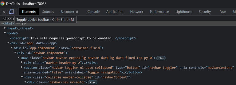
then back in chrome you can turn on a smaller device like an iPhone so you can see the 'Hamburger Menu' If you click on it nothing happens since were not using popper.js so we need to provide that functionality. So remember those two Vue ref's we used? Well were going to use them now so we can make the menu show and collapse. The first thing we need to do is add some code to our <script> block starting with importing ref from Vue. We will then use some type declarations to define the refs used in our template and add a function that we will bind to the <button> in the template. A stubbed out script tag for this should look like the following.
<script setup lang="ts">
    import { ref } from 'vue';

    const navbarToggler = ref<HTMLButtonElement>();
    const navbarContent = ref<HTMLDivElement>();

    function toggleMenu($event: PointerEvent) { }
</script>
We can now update the buttons template by adding @click="toggleMenu" to it so the button should now look like the following block.
<button class="navbar-toggler ml-auto collapsed"
   type="button"
   id="navbar-toggler"
   ref="navbarToggler"
   aria-controls="navbarContent"
   aria-expanded="false"
   aria-label="Toggle navigation"
   @click="toggleMenu">
      <span class="navbar-toggler-icon" />
</button>
If you add an alert or console.log statement to the handler you can test that its being called but I'm not going to do that here. So now that were stubbed out we need to implement what happens when you click. The first thing we should do is some type checking to ensure our refs are valid, next we need to toggle the class .collapsed on the toggler button and toggle .show on the navbar content. In addition we will go ahead and flip the aria-expanded on the navbar toggler as well. Our code will look like the following block.
<script setup lang="ts">
    import { ref } from 'vue';

    const navbarToggler = ref<HTMLButtonElement>();
    const navbarContent = ref<HTMLDivElement>();

    function toggleMenu($event: PointerEvent) {
        if (!navbarToggler || !navbarToggler.value || !navbarContent || !navbarContent.value) {
            return;
        }

        navbarToggler.value.classList.toggle('collapsed');
        navbarContent.value.classList.toggle('show');

        if (navbarToggler.value.ariaExpanded === 'true') {
            navbarToggler.value.ariaExpanded = 'false';
        }
        else {
            navbarToggler.value.ariaExpanded = 'true';
        }
    }
</script>
You can see we do some checking to ensure we have valid refs, by checking the ref and its value. Next we access the actual value which is strongly typed as HTMLDivElement and HTMLButtonElement and use the classList property to toggle .collapsed and .show. In addition we also flip the aria expanded value. Now if you start the site and go to a mobile display you should be able to click on the hamburger and see it expand and close! Well were not done yet so don't get too excited we need to add some dreaded unit tests, then we will be done with our Navbar!
Navbar Tests
We are going to add two tests to our Navbar.spec.ts test suite. The first is to test that clicking the hamburger menu triggers the click event handler and the second test is going to verify that when slot content is provided that it renders. To accomplish the first test were going to need to add a mock function using jest. A mock function is a dummy that we can test to see if it was triggered without actually running the components toggleMenu function. To create a mock we just need to define it so const toggleMenu = jest.fn(); will work and we will pass it into the global mock property of the mounting options. We made our testing pretty easy by using id attributes so we can search for #navbar-toggler in our test and then trigger a click event. The test will look like the following.
it('Can expand the navbar hamburger', () => {
  expect(wrapper).not.toBeNull();
  expect(wrapper.exists()).toBeTruthy();

  const toggler = wrapper.find('#navbar-toggler');
  expect(toggler.exists()).toBeTruthy();

  toggler.trigger('click');
  expect(toggleMenu).toHaveBeenCalled();
});
As you can see in the code we first make sure that the wrapper is valid, we ask the wrapper to find our button and then we trigger the click. Each step we validate that we found the target item were looking for.
The next test is just as simple. Were going to use the slots property of the mounting options and pass in some simple html content. We will use const slotContent = '<p>Slot Content</p>' and make sure that the content container renders it. That test looks like the following.
it('Renders the slot content', () => {
    expect(wrapper).not.toBeNull();
    expect(wrapper.exists()).toBeTruthy();

   const contentContainer = wrapper.find('#navbarContent');
   expect(contentContainer.exists()).toBeTruthy();
   expect(contentContainer.html()).toContain(slotContent);
});
As you can see again we start by validating our wrapper then we find the content container and check that its html includes the slotContent variable we passed as our slot mock. Pretty simple right? Our final test file will look like the following.
import { mount, VueWrapper } from '@vue/test-utils'
import Navbar from '@/components/Navbar.vue';

const toggleMenu = jest.fn();
const slotContent = '<p>Slot Content</p>'

describe('It tests the Navbar.vue component', () => {
    let wrapper: VueWrapper<any>;

    beforeEach(() => {
        wrapper = mount(Navbar, {
            global: {
                mocks: {
                    toggleMenu,
                },
            },
            slots: {
                content: slotContent,
            }
        });
    });

    afterEach(() => {
        wrapper.unmount();
    });

    it('Tests that the Navbar renders', () => {
        expect(wrapper).not.toBeNull();
        expect(wrapper.exists()).toBeTruthy();
        const navbar = wrapper.find('#navbar-component');
        expect(navbar.exists()).toBeTruthy();
    });

    it('Can expand the navbar hamburger', () => {
        expect(wrapper).not.toBeNull();
        expect(wrapper.exists()).toBeTruthy();

        const toggler = wrapper.find('#navbar-toggler');
        expect(toggler.exists()).toBeTruthy();

        toggler.trigger('click');
        expect(toggleMenu).toHaveBeenCalled();
    });

    it('Renders the slot content', () => {
        expect(wrapper).not.toBeNull();
        expect(wrapper.exists()).toBeTruthy();

        const contentContainer = wrapper.find('#navbarContent');
        expect(contentContainer.exists()).toBeTruthy();
        expect(contentContainer.html()).toContain(slotContent);
    });
});
Here you can see the mounting options object were passing in to the mount call with the mocks and slots. You can read more about the available mounting options in the official
documentation.
What Next?
Well just to add a little more to our Navbar component were going to add a prop for content alignment, we will take a string prop named alignment and allow the following values: left or right. To do so were going to use the defineProps macro that Vue provides. In addition to adding the prop we will need to update our template and provide a class binding on the div with .navbar-nav. So to define the prop we will provide an object that has type, required and validator properties such as the following.
const props = defineProps({
    alignment: {
        type: String,
        required: true,
        default: 'left',
        validator: (value: String) => {
            const lower = value.toLowerCase();
            return lower === 'left' || lower === 'right';
        }
    }
});
So our prop is now defined and as you can see it only allows String values of 'left' or 'right'. Also, now that we have defined our prop we have access to it in our template. So we can change our class binding to the following.
<div
    :class="{'navbar-nav': true,
             'ml-auto': alignment === 'right',
             'mr-auto': alignment === 'left'
     }">
        <slot name="content"></slot>
</div>
Sweet you now need to go to App.vue and add alignment="left" or alignment="right" to the <navbar>. Oh but wait, we broke our test again, well this isn't a big deal and is an easy fix, we need to provide a props property to the mounting options and provide it the proper value. So if you go back to Navbar.spec.ts you can add the following to the mounting options and the tests will pass again.
props: {
   alignment: 'left',
},
Sweet, so now if you run the site you can change the value of the prop and see that our navigation content moves from the left side to the right side and so on. Now that we have this prop we should add a test to ensure it renders the content properly, however I will leave this up to you as an exercise.
Wrapping Up
Whew that was a lot, I hope I kept you through all of that and that you found it informative. Next time we are going to do a lot of things.
- We will add a component for our Navbars nav items.
- Add support for routing with Vue-router.
- Update our
App.vueto display different routes than just the currentHome.vue - Add another page.
Again I really apologize for publishing the last article without the Jest setup so hope this article has more than made up for it. Feel free to drop questions here or on the Github repo.
Disclaimer
All screenshots taken in Visual Studio community edition or in Chrome on GitHub. Visual Studio is copyright Microsoft. Chrome is copyright Google. Github copyright Github Inc.
Thank you for sharing this amazing post on HIVE!
Your content got selected by our fellow curator @priyanarc & you just received a little thank you via an upvote from our non-profit curation initiative!
You will be featured in one of our recurring curation compilations and on our pinterest boards! Both are aiming to offer you a stage to widen your audience within and outside of the DIY scene of hive.
Join the official DIYHub community on HIVE and show us more of your amazing work and feel free to connect with us and other DIYers via our discord server: https://discord.gg/mY5uCfQ !
If you want to support our goal to motivate other DIY/art/music/homesteading/... creators just delegate to us and earn 100% of your curation rewards!
Stay creative & hive on!