Hive-Engine Update, is it Windows all over again? 🪦

New Hive-Engine Update Review!
In a perfect world technology is supposed to make our lives easier. Just like the old joke about Microsoft ruining Windows with every iteration of updates, it appears Hive-Engine may be following in their footsteps. The latest hive engine update may look snazzy at first glance, but all the newly added bells and whistles seem to come at a huge cost to the speed & performance of the website.
I miss the old hive-engine! 😭
What I liked about the original hive-engine was it’s simplicity. I could do everything I needed from one place, a simple lightweight webpage used to scan the markets and place a lot of quick trades. However all that has changed with the latest update because now hive-engine is more like a gauntlet of pages to navigate which turned into a cumbersome experience. I’m still trying wrap my head around the new site, I still need to use it, but it's going to take some time to soak in all of this update to adapt to the new layouts. In the mean time here is my simple review of the new hive-engine.com, I think it was more trouble than it was worth!
A new Slower UI!
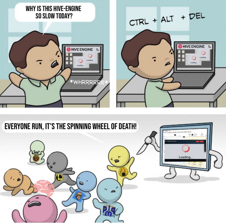
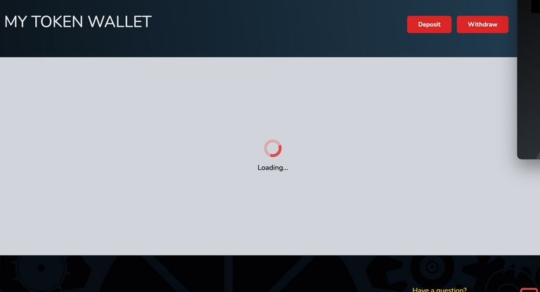
After placing a trade, or any transaction for that matter, I noticed the spinning wheel drags on and on, a lot longer than before. It seems to lag about 4 times as long as I remember. This really hinders setting a trade, I don't think i've done nearly as many orders since the update, it just takes too long and i'm going to have to re work the entire way I trade on hive engine now. I think hive engine needs to look at streamlining this part the most because time is valuable and this is the one thing we all will be using hive engine for the most. If I can recall Binance didn't make us wait 7 seconds after placing a trade with a spinning wheel, if they did they would literally lose millions of dollars in trading fees per year alone. In reality Hive-Engine is still a heck of a lot better than doing an ETH trade on Uniswap, but just yesterday before this update this wait was more like 2 seconds max, so this really needs to be looked at, stat!

With the new update HE is more Cumbersome to use without the price tick link!
Less Features than previous Hive Engine
For instance we used to be able to click a link to automatically populate prices and amounts. Hopefully little things like this will be added back.

Takes longer to scan through all your coins now that the list is broken into pages
Why do I need 5 pages for 98 results? Why is the list so short? Now each page only shows 20 results, I think it should go back to showing at least 100 results per page! I liked one long list so I could easily compare all the changes really fast. When I can see the top gainer of 98 coins all at once it is a lot easier for me. Having a lot of little pages to look at really breaks up my concentration, and is more of a game of memory than a game of trading. Sure it’s fine, but I don’t see what was wrong with a long page and scroll bar. I wish there was a way to enable or disable some of these new features. Now I’, thinking about selling all the extra coins just so until I can fit all my coins on one list on the first page?.

Another change is to the wallet, it doesn’t show the value of your liquid tokens like it used to, instead it only shows the total value of staked and or delegated all bundled together, which isn’t as useful to me because it's not as relevant than the value of the liquid tokens that I can sell now. It's just a lot of changes to take in after my brain had already gotten used to seeing the data in a different way.
Don't get me wrong, the update does have a lot of improvements, I do like seeing some of the these new data views, especially the new colorful new charts. I love to see the actual usernames associuated with a buy and a sell on the trade history page, would still like to see those listed on the actual buy and sell orders too. I also like to see the total value of the portfolio now up on the top, I can't remember if that was there before, but it is way more visible now. Even though I do like these new additions, I think usability shouldn't take a back seat to added bells and whistles, and overall after testing I've come to the conclusion that new upgrade was more like a downgrade when it comes to ease of use.
I think all the new junk they jammed into the website really hurts the speed speed of the site, and may need to be shaved back down. I would love to be able to have access to a button that lets me use the old website, but somehow I don’t think that is possible.

Maybe it's just me that me doesn't like the new hive-engine, what do you think about the new updates? Is there anything you noticed that is good, bad, or should be improved? If you can think of something, please let me know what in the comments below.

Yeah, they should've previewed it and let us vote, or something.
I liked the old format better, too.
They could give us an option, at least.
Yeah like a link to use the old site if you want, that's what UPS does when they update. I'm having a hard time using it like I used to, feels like i'm trading in quicksand.
I wish atleast they will add that latest price tick link to do easy trades
$WINE
Congratulations, @theguruasia You Successfully Shared 0.200 WINEX With @coininstant.
You Earned 0.200 WINEX As Curation Reward.
You Utilized 2/3 Successful Calls.
Contact Us : WINEX Token Discord Channel
WINEX Current Market Price : 0.360
Swap Your Hive <=> Swap.Hive With Industry Lowest Fee (0.1%) : Click This Link
Read Latest Updates Or Contact Us
Yeah trading has turned into a chore on there, i used to be able to do 4 trades in the time they make me wait to do one now. Gonna have to rely on bots from now on to do the bulk of the trading I think.
Exactly the price tick link, that's what it was called. Just added that to the post explanation, thanks!
$WINE
View more
I absolutely agree.
Before, you could see each user's wallet.
And I miss the old version.
!LOLZ
!LUV
!BEER
lolztoken.com
Because he thought there would be shots.
Credit: reddit
@coininstant, I sent you an $LOLZ on behalf of @eii
Use the !LOL or !LOLZ command to share a joke and an $LOLZ. (3/6)
@eii(7/10) gave you LUV. H-E tools | connect | <><
LUV in the dark? The confirmation-reply may soon be turned off. This would be to conserve and replenish Resource Credits. Even while operating in the dark, your LUV command will still go through as usual. You can always monitor LUV in your wallet, at explorer A or at explorer B, or best, in real time at the luv-log channel on Discord.
Tap to help.
Yeah, it looks like they are still working on it, I just noticed them bring back the value for the liquid tokens instead of showing the value of the liquid plus staked. Hopefully they work out all the kinks.
thank you very much for sharing the news, have a nice day and have a great weekend
thank you very much for sharing information, have a good day and a great mood
Use leodex or tribaldex.