Overwhelming FOMO... Is Bad for You!
I briefly read a feed abounding of FOMO. I stay as far away as possible from such places especially in times like these when the market itself provides all the FOMO fuel needed to make you feel great (better than you should), if not more.
Both FOMO and FUD are contagious. So you don't need more positive reinforcement of your FOMO when things are going well or to go onto the depression slope with the FUD when things are going bad.
I certainly don't. And have been doing relatively well recently keeping my cool and just taking my decisions without getting drunk with more FOMO than a relatively manageable dose.
Like everyone, I love it when I see my portfolio (or one of the the assets in it) going up. But I keep myself busy with things that don't revolve around keeping an eye to the market all day long, to not get caught by the FOMO drug, from where it's difficult to get out and regain your control.
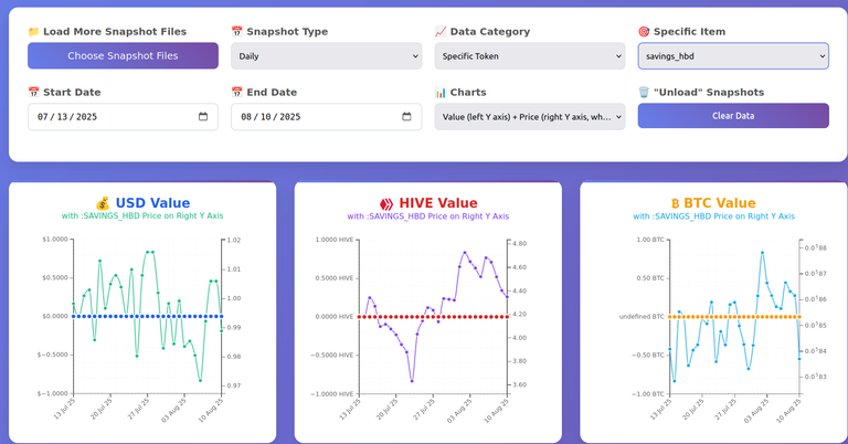
One of the things I keep myself busy with is my Hive Portfolio tools, particularly the charter lately.
Now that some time has passed, even my weekly charts started to take some shape:
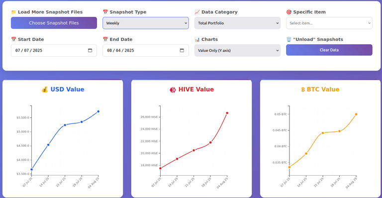
Let's see what I've been working on lately.
Total Amount or Price of Token on Right Y Axis
When you select a specific diesel pool or a token, you can show its total amount on the secondary line chart, with the scale on the right Y axis. This is useful when the value of the asset represented on the left Y axis plunges or jumps not as a result of price variations, but as a result of you removing from or adding to that stash.
Here is an example for a diesel pool:
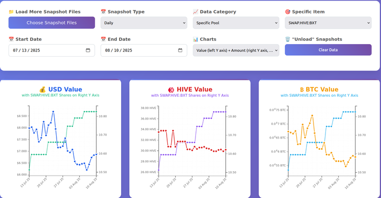
Here you can see that on the account charted, I compounded my liquid BXT to the small position weekly.
And this for my LEO stash:
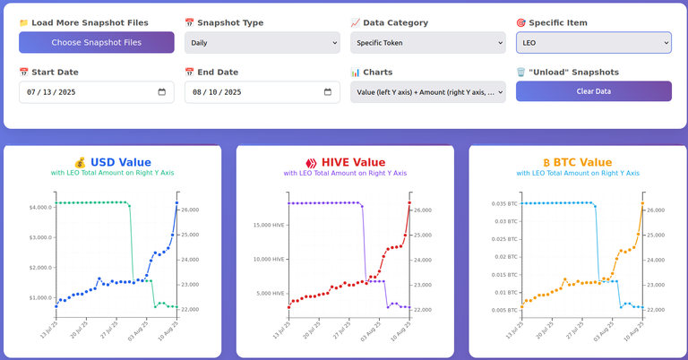
You can see the uptrend everyone is so excited about (for good reason), and also how my stash varied. Note that the initial drop to 23k-ish was a delegation to someone, which I withdrew. Once it came back, I started to power down, and that's the drop to 22k-ish. My first PD didn't come, but it is automatically off the totals when it is the next chunk to PD.
That means I haven't sold serious amounts of LEO... yet. But I did some selling. Probably below 500 LEO so far.
Price on the right Y axis isn't as useful—as it usually follows the same path as the value chart—but in some cases it can be useful. Unlike the total amount, it is also different for each chart, based on the currency of the chart.
Here's what the chart of SWAP.HIVE looks like for one of my accounts, where you see at the end a big jump in the value of the tokens, without any jump in the price, meaning more SWAP.HIVE got added to the account, after a short time before, some SWAP.HIVE left the account since value dropped without a major price drop:
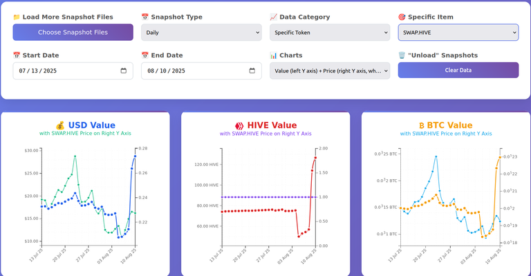
Exact values can of course be seen by mousing over data points (or tapping on mobile), and looking at the info tooltips.
Speaking of tooltips...
Tooltip Enhancements
Have you ever wanted to copy the content of a tooltip when using an app? I have, and I don't remember any app that allowed us to copy the content of a tooltip.
Well... Hive Portfolio Charter allows users to copy the content of tooltips. To do that, one has to double click (or double tap) on any data point. There are enough visual indications to tell the user that the content of the tooltip has been "captured" (i.e. copied to clipboard—as text, not as html).
That's something else I worked on since the last update, but despite being a cool update, in my opinion, it was a smaller one compared to the others, in the amount of time it took to implement.
Of course, since we are here, the secondary chart needed tooltips too, and I also added the HBD price to tooltips, always on the USD chart, and only when a HBD-related token was selected on the other two charts.
Here's an interesting chart... with the price of HBD, in USD, HIVE and BTC. So, another context where the price chart can be useful.
Decimals, BTC in Superscript Notation, Label Sizes
You'd be surprised, but there is a lot to talk here. But I won't bore you with the details.
From a birds-eye view, what's important is that the tool is getting "smarter" when selecting the appropriate number of decimals to show based on the scale, the format of BTC in which to display the value, and the sizes of the labels. And that for both Y axes.
On the format of BTC, that refers to small BTC values, and displaying it in a way to avoid writing too many zeros after the decimal point which are hard to read by humans and need too much space for the axes' labels too.
In this case, a value like 0.00000243 BTC might be represented like 0.0⁵243, where the exponent (5, in this case) is equal to the number of zeros after the decimal point until we have a non-zero digit. The number of significant decimals after the exponent may be lower, but at least 1. They should be enough to have distinct ticks on the Y scale.
This is an example with superscript notation for both Y axes of the BTC charts:
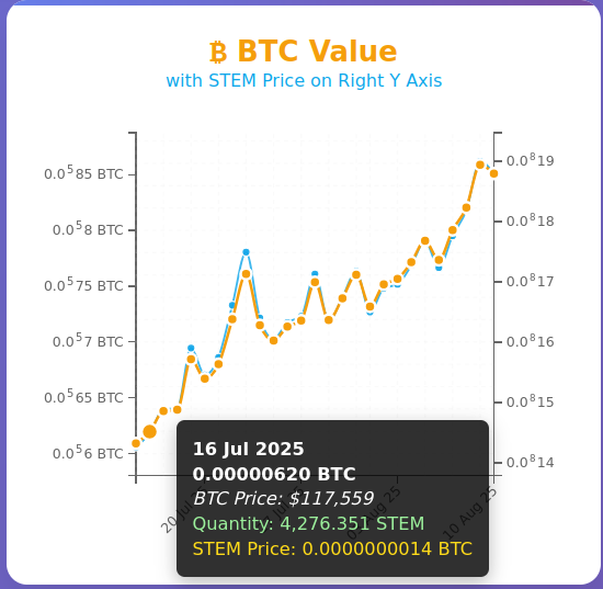
Note that the secondary line chart is almost entirely obscured by the primary chart. I will, in the future, make a way to bring the secondary chart to front, when the user wishes.
Label sizes are no longer fixed, but they are approximated based on the values they need to hold.
Fixes to Chart Resizing and Mobile Friendliness
Charts had issues remaining readable after some window resizing—including maximizing—so I had to fix that, which I did.
The other problem was the charts didn't fit in the portrait orientation of a small-screen mobile device. Initially, I tried to squeeze everything in the available space, but it simply looked awful, and still didn't fit. So, the solution was to ask the user to switch to landscape orientation to see charts if they are on a small-screen mobile device. Like this:
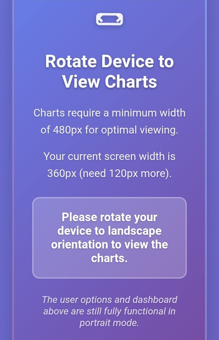
There is actually an effect that makes this even better looking.
And here's a chart on mobile:
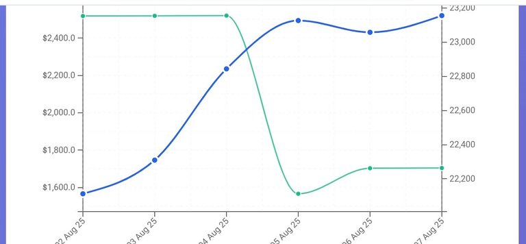
It needs some scrolling on the vertical, but fits well and has more than enough space on the horizontal in landscape orientation.
That's It!
Here's where you can find the tool if you like it. Of course, a big part is generating the snapshots used to generate the charts. I use my own tool Hive Portfolio Tracker for that, which you are free to set up and use as well.
Posted Using INLEO
Instead of FOMO and FUD, what I am looking at during this bull market is these 30 indicators: https://coinmarketcap.com/charts/crypto-market-cycle-indicators
Considering the exposure CoinMarketCap has, these indicators could end up being a self fulfilling prophecy. With zero indicators triggered, I would say we are in a safe zone for FOMO.
For crypto, in general, yes, we are probably just at the beginning (maybe toward middle, depending on where you consider it started) of the last phase. And the indicators you linked probably offer a good-enough image, unless people wait for too many indicators to trigger. For specific tokens, I'd be more careful, since not all of them will top at the same time.
One thing I have come to realize is that the biggest correlation ETH and BTC has with is the money supply. Any interest rate cut could have massive implications.
https://inflationchart.com/eth-in-m3
View more
You created a very nice tool!! 💪
And regarding FOMO and FUD... Being years in crypto helps a lot in avoiding both... While others are celebrating and calling the moon, I will take profits progressively... Just like you said in another comment... ;)
Thanks!
Yes, I think experience helps a lot mitigating both. But they are contagious and if you hang around people who are either enthusiastic about the price action or gloomy, you will eventually borrow some of that sentiment, regardless of what reason says you should do.
I'm sure people are enjoying the $LEO action. I will sell some at some point, but it still seems to be heading up. It's already passed $ST--M and may well pass $HIVE soon.
I'm not really one for constantly watching charts though. I accept that I will miss out on good deals.
!BEER
Yes, it's a nice thing happening for people in the ecosystem, who have been down for a long time because of the price action.
I prefer to take some profits, progressively.
The tool is coming around quite nicely so far.
As for FOMO/FUD, I think that happens everywhere. Emotions are your worst enemy when it comes to investing/trading.
Emotions are ok because they make you act (even for taking profits - that's where you become careful and want to protect your gains). Too many emotions cloud your judgement and you won't be able to take the best actions, even when you have a predetermined plan.
For the most part, I'm not much of a chart watcher... and I definitely miss out on some things because I see them a week after the fact and am left thinking "That would have been cool, if only I'd been in the know."
It's nice to see $LEO on the rise, and it amuses me that part of my stash comes from the original airdrop to PAL token stakers, back on the legacy chain. So, any profits are basically "free." A bit like still having the $BTC you mined on your PC, back in the earliest days...
Nice! You kept those airdropped LEO tokens. I didn't. But after a while of seeing Khal was determined to build his platform, I started slowly building my stash.
It’s so easy to get caught up in the hype and let FOMO take over, but staying focused really makes the main difference in the long run. I've learned something from you, I'm grateful 🥰🙏
Yep, hype is slowly building up for the crypto space. That's usually a sign the last phase is in, and we are talking about a few months at most until "the end".
That's something, then gotta be prepared
El antídoto del FOMO es el JOMO: Joy of Missing Out. Es el placer de decir "no necesito estar en todo", y elegir lo que realmente te hace bien.... un saludo desde Argentina amigo! saludos!
What I like even more is that I understood everything you said without translating it, which is cool, since I don't speak Spanish. 😃 JOMO sounds like a nice thing everyone should experience, at least every once in a while!
https://x.com/jewellery_all/status/1954538474381697343
View or trade
BEER.Hey @gadrian, here is a little bit of
BEERfrom @steevc for you. Enjoy it!Learn how to earn FREE BEER each day by staking your
BEER.View or trade
BEER.Hey @gadrian, here is a little bit of
BEERfrom @steevc for you. Enjoy it!We love your support by voting @detlev.witness on HIVE .
https://x.com/lee19389/status/1954689516108918970
#hive #posh
Congratulations @gadrian! You have completed the following achievement on the Hive blockchain And have been rewarded with New badge(s)
Your next target is to reach 210000 upvotes.
You can view your badges on your board and compare yourself to others in the Ranking
If you no longer want to receive notifications, reply to this comment with the word
STOP!discovery 35
This post was shared and voted inside the discord by the curators team of discovery-it
Join our Community and follow our Curation Trail
Discovery-it is also a Witness, vote for us here
Delegate to us for passive income. Check our 80% fee-back Program