Travel Booking website. ( Designed by me)
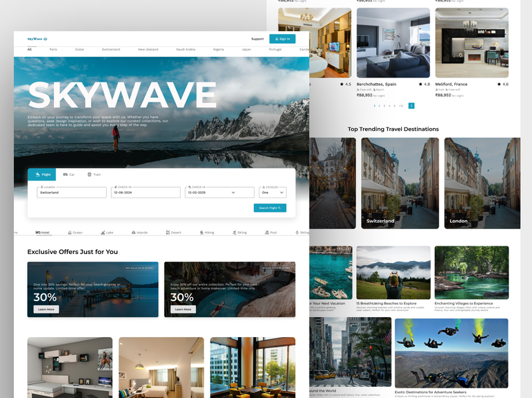
Hey guys, today I bring to you "SKYWAVE" a website people people can use to travel and book any place or their choice around the world.😀
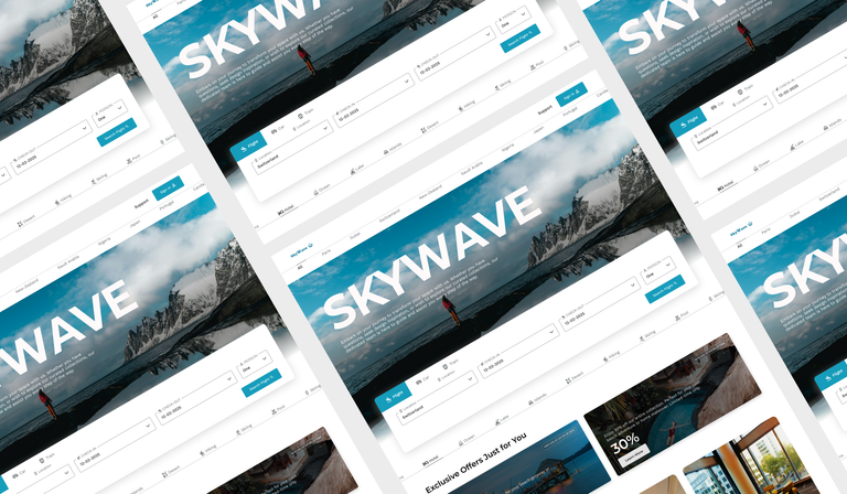
And also I have to confess that working on this website has been a wonderful journey that has significantly enhanced my understanding of human behavior and the importance of simplicity in design.🤩
As I delved into the world of travel websites, I couldn't help but notice something in common among the most successful travel booking sites, like Airbnb and Expedia: simplicity.✨
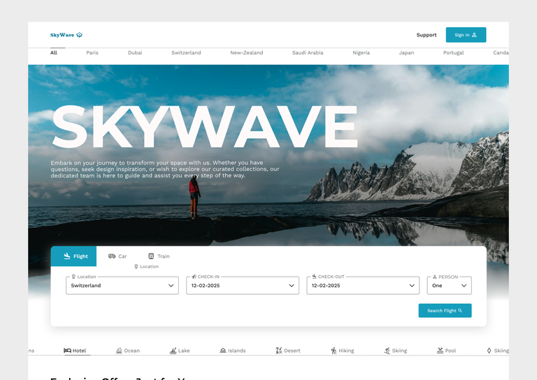
Unlike the various elaborate designs showcased on platforms like Dribbble, these leading travel websites have mastered the art of making things easy for users, some dont even have great UI's but since they're quite easy to understand then it's cool.
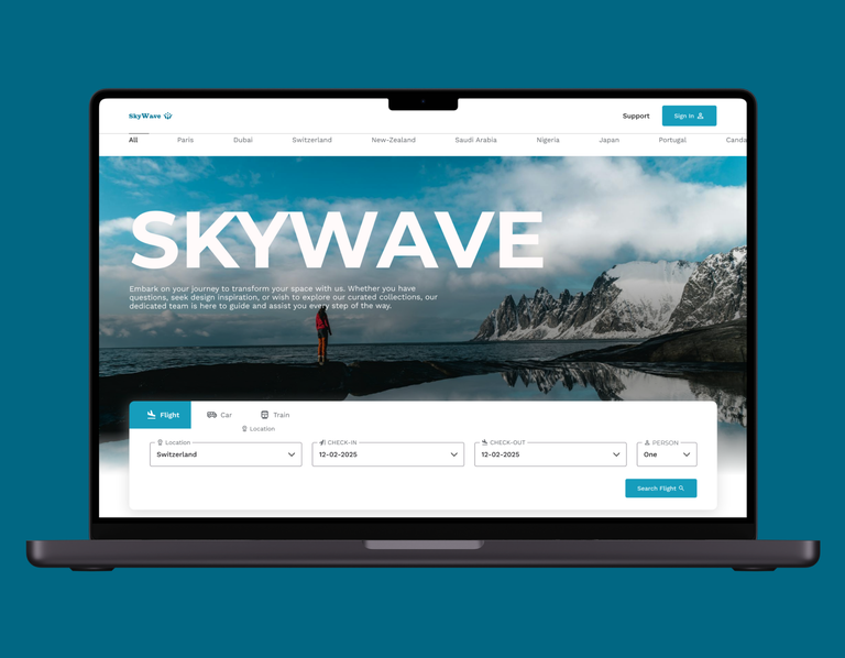
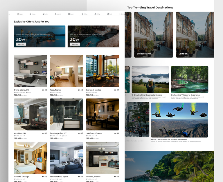
Additionally, I learned that not all visual appealing designs equate to success. It's about creating a clean, welcoming interface that anticipates user needs and delivers information in a pleasing way. For example, clear calls-to-action, concise content, and consistent design elements all contribute to a smoother user journey
Anyways do well to lemme know what you think in the comment section, would gladly love to hear it, thanks. 🤗💯
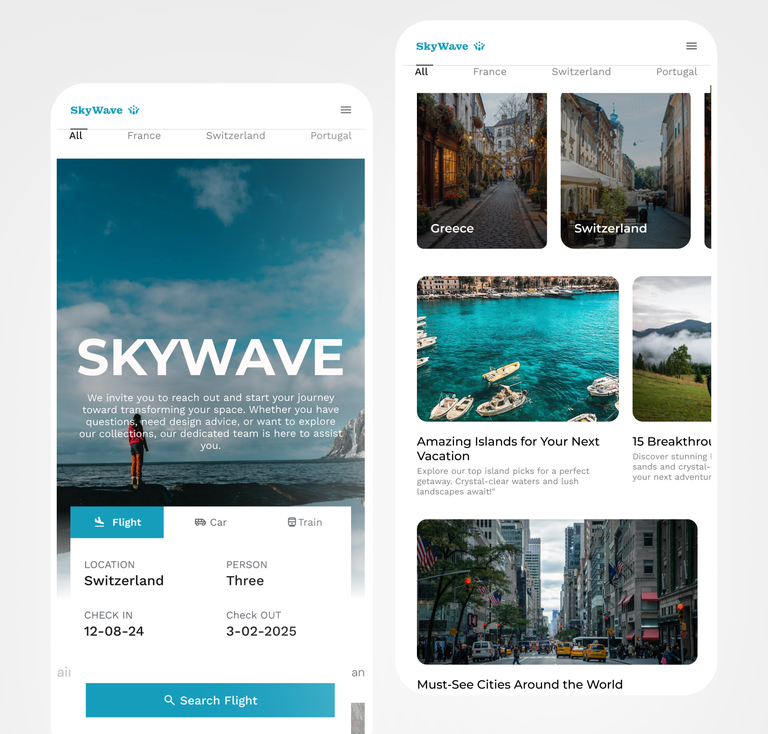
And als for those who wants a website, don't hesitate to reach out let's bring your idea to life, I mean even you that's running a small business, you need a website to boost your sale, so reach out😃!!
