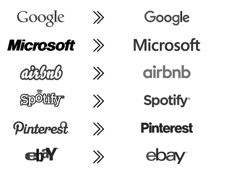
Logos got boring 😂
Logos sind irgendwie langweilig geworden 😂 Kennt ihr noch weitere Beispiele? Warum denkt ihr, dass Logos die letzten Jahre immer simpler werden? Eine Theorie ist, dass es ein allgemeiner Design-Trend ist, oder wenn Firmen eine gewisse Größe und Bekanntheit erreicht haben, die Einzigartigkeit des Logos nicht mehr so wichtig ist und sie daher ein schlichteres, neutraleres Logo bevorzugen. Was denkt ihr?
https://x.com/waitbutwhy/status/1836624661330702435
English
Logos have somehow become boring 😂 Do you know any other examples? Why do you think logos have become more and more simplistic in recent years? One theory is that it's a general design trend, or when companies have reached a certain size and recognition, the uniqueness of the logo is no longer so important and they therefore prefer a simpler, more neutral logo. What do you think?
Naja der Wiedererkennungswert ist immer noch wichtig :-)
Weniger verspielt wirkt vielleicht (laut Studien?) seriöser/professioneller, denke ich. Bestimmt haben das irgendwelche Marktforscher, Wirtschaftspsychologen oder ähnliche Experten untersucht.
!LOLZ
lolztoken.com
They both measure wait.
Credit: reddit
@vikisecrets, I sent you an $LOLZ on behalf of thehockeyfan-at
(4/10)
Farm LOLZ tokens when you Delegate Hive or Hive Tokens.
Click to delegate: 10 - 20 - 50 - 100 HP
We went from this
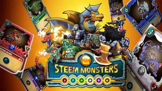
To this
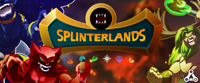
I really liked the old one
Haha, even Splinterlands followed the trend 😂
I prefer the older logos as well. The uniqueness looks way better than the bland versions now.
I believe that the first logo always has to make a striking impact on the consumer. Once they can be recognized just by the word like Spotify, it doesn't matter what their logo design is.
The simpler the logo, the more we get familiar!
People love simple things and I’m sure that’s why they made their logos more simple
Perhaps it is because nearly all of those have significant Vanguard investment? :D
If they make it simpler, people will be more familiar with the brand
I love lettered logos unlike the ones of artworks
Logos are changed due to the public interests and sometimes companies try to change the logo for simplification. Brands become better and attractive for users when Logos are changed. What I think it works sort of like updates.
They made logs simple because simple things are easily accepted and that was the trend
Ist genauso wie mit dem Logo für Firefox. Es wurde immer simpler.
Oder das Instagramlogo sieht eher aus wie eine Waschmaschine.
Haha, da ist tatsächlich was dran. Alles sehr homogen heutzutage.
Weil die alle Schiss haben eine Abmahnung zu bekommen, dass sie G-Fonts nutzen 😂
Haha 😂
Ich denke das ist ein Mix aus beidem :-)
Logos are really evolving over the years and I belong this is just the beginning