Smarter Presentation Slides
While I wrote all my reports and made all my presentation slides myself all the years at the university, I actually never had MS Office installed. What's perhaps even more interesting was how people would often ask how I designed my slides. I had a trick, but I needed to NOT have MS Office installed.
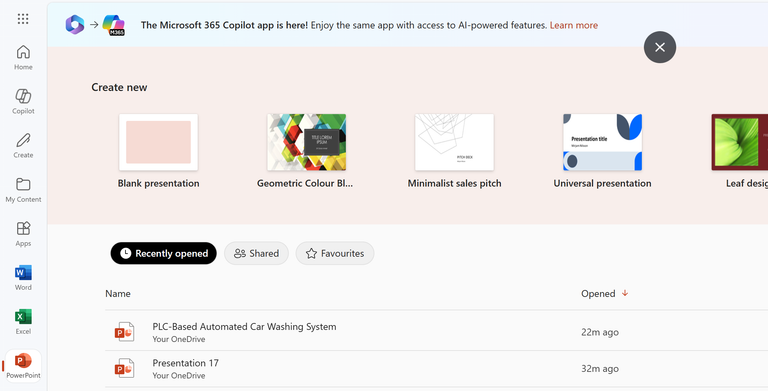
You can only use the MS Office desktop apps—Word, Presentation, Excel—with a 365 Office subscription. It's free to use on the web app, however, to some extent. And when I figured that using it online was way more convenient for me, I just never bothered to have it installed.
The two most important things for me about using the online version, other than the fact that it's free, are the access to my file and instant changes on any device and the Designer mode on Presentation. With Office installed on my phone, I get to access and download my documents and even see the real-time changes. Google does this with theirs now, but I have stuck with MS for the longest time now. The Designer mode is my focus today. It's how I make my slides look better very easily.
I prefer a clean, minimalist design for my slides. But the templates available—I find them to be generic, overly used, and boring. And during my presentations back at the university, chances were always that someone else would pick the same design I would. So here's what I'd do instead:
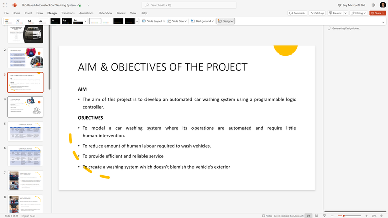
Firstly, I add all the necessary text details. I never read verbatim, so I only put up the salient points. That helps me keep the design simple and to avoid reading from the slides during the presentation. And then I'd pick a font and format the text.
The next thing I do is add visual aids. I add images relevant to the slides. They could be my own photos—perhaps from completing the project or something—or just random ones from the net. I usually never try to position them or anything. And then I'm almost done.
With everything to be on the slides present, I then move on to the Designer mode. That's where I pick design suggestions that work with the text and images present.
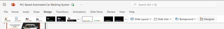
You'll find it under Design. It might take a second to pop up, depending on your network speed. And when you select it, it shows you design suggestions. This pretty much does a lot of work for me. I find the right one and continue with it.
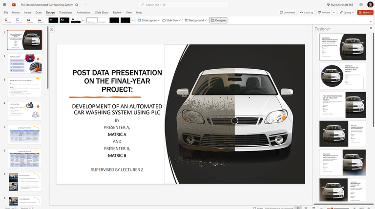
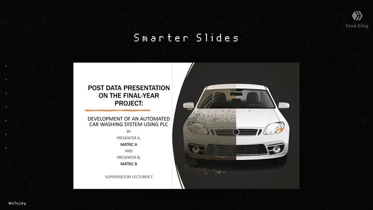
Usually, I have something different for my thumbnail. So I'm likely to not continue that design format through the rest of the slides. As for the rest of the slides, I repeat the same process, but with one thing in mind: Since the visual suggestions are based on the data present—text and images—they may vary across the slides.
The slightly different designs may compliment each other eventually and still work. In other cases, I simply pick the design format I like, duplicate that slide a few times and then move the data from the other pages accordingly.
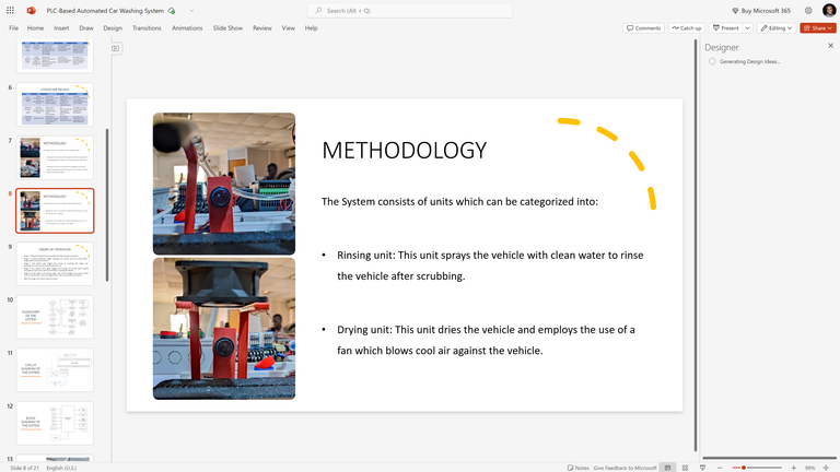
If you observe closely the images above, you'll see that the design formats are different, but they work anyway. And the images are properly formatted. That's all. In a few minutes, my slides are ready, looking much better than the old templates.
To access the free Microsoft Office, visit -> https://www.microsoft365.com/
Images in this post belong to me
Posted Using INLEO
It's not under design; I'm also minimalist when it comes to keeping my desktop or making a presentation. I like the way you built up the design, people can focus more on what you are saying.
I have seen it but I never used it. But hearing from you I think I will need to give it a try for it. I hope that the experience will be good.
This actually looks nicely. Well, I will be having a presentation when I get back to school and I think this would be a good thing to try. Thanks for sharing bro.
I am already seeing the advantage of the online version. One of the thing is uniqueness, it can boost your project during presentations.