x4 Battle - Social Media Challenge


I was astounded by the new designs and the fight match in Splinterlands. It's a good improvement, and the battle is faster than before the 3x was converted to x4, allowing prolonged matches to be seen more swiftly. I'm going to show the new game update with two battles. enduring waiting a long time, you may watch it fast and efficiently because it is far better for quicker action.

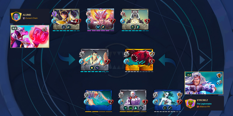
Compared to the previous ones, the summoner looks stylish in its new position role in the corner sides, and the new background is really intriguing. The arrows in the center serve as a guide to the monster; if it dies, it advances to the next spot.

The combat button is currently located in the upper middle portion of the game. You can check the current round and have the option to skip a battle so you can see the winner of your battle immediately.

Important guidelines to keep in mind are also displayed on the side, which is simple to navigate. You can examine the ruleset, the mana cost, and the available elements. Previously, it was in the middle of the site, under the summoner. It's all about the above corner today in its new update on the game site.
Battle Link #1 : https://next.splinterlands.com/battle/sl_32c66b95e8f1a8c1195884fd7ef51f8e
BAttle Link #2 : https://next.splinterlands.com/battle/sl_3beaf2908cbf439990378025eddca9ed
Youtube Video Battle
To show you how fast the action is in Splinterlands, I used to make it to x4 battle.
Those longer battles will be easier to observe, so try the x4 to see whether you prefer x2 x3 or the max, which is much faster to end a war and makes it simple to check the match's strategy. I think the new update is good; the faster the battles, the more enjoyable they are in my opinion.

Join the game with my referral link: https://splinterlands.com?ref=xykorlz
if you like my content please follow me for more 🤗


!LOLZ
!ALIVE
!PIZZA
$PIZZA slices delivered:
@apoloo1(5/5) tipped @xykorlz
Thanks for sharing! - @libertycrypto27
