Ask the photographers!

Hive has a lot of photographers. There is a big difference in the level of experience. There are professional photographers with expensive gear and also beginners that use their smartphone camera's (and everything in between).
We all share the same passion; taking photographs.
I noticed that a lot of photographers don't get a lot of comments on their phorography posts. I think constructive comments could help amateur phorographers to improve their skills and become better photographers.
Thats how I came up with this blog. This blog is ment for (amateur) photographers to share one of their photos. All other photographers on Hive can then give their recommendations on the photo so the photographer could improve their skills.
I want to challenge photographers to share a photograph in the comments so others can judge it.
You can also ask specific questions if you like.
Try to give positive feedback that the photographer can use to improve his of her photography skills.
I'll judge every photo in the comments myself.

FriendlyMoose
Thanks for checking out this post!
Be sure to follow me if you want to see more of me.
Also check out some of my projects on Hive below!

A weekly blog with an overview of all the photography contests on Hive. Find these posts by clicking the following tag: #photocontests.

Join my weekly photography contest. A photocontest for every photographer; amateur or pro with a different subject every week. Check out the following tag: #pobphotocontest.

Do you have a passion for cycling? Then join my Cycling Community!
You can support the Cycling Community by clicking one of the amounts below

I think this is a great initiative @friendlymoose.
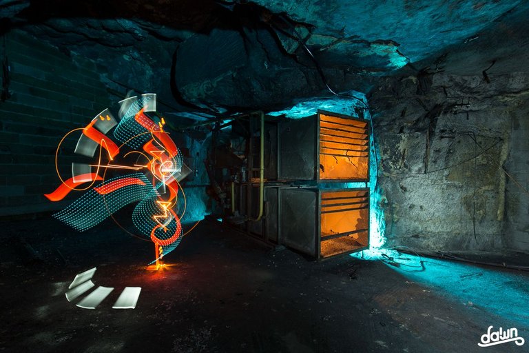
Here's my submission, please give me your feedbacks guys and don't hesitate to ask anything you want about it :
Hello, I leave my opinion.
Creativity and technique used for the desired purpose = Perfect.
Framing, the line of flight and the circular movement of the model following the effect = Perfect.
Colors? If there were more colors it would help a lot. Given that it's just one, orange-yellow from the flash with external light ruins it (in my opinion).
So, I edited in black and white. It would eliminate the "defect" of light and it would become more attractive, more subjective. It would take longer to understand the image, which would make it more enigmatic.
I took the liberty of doing a simulation that I attach. To imagine yourself you have to experience it.
Hello @cryptoreforma,
Thanks for your feedback :)
It obvious that I didn't use the flashgun the best way, it lit the floor and I agree it really unaesthetic.
Concerning colors : I usually use complementary colors. For that picture, I would use light-blue. But I had no extra tripod nor extra flashgun to put a colored gel on it and make a light-blue backlight. Next time I'll manage to fix that for sure.
Usually I'm not a big fan of B&W in lightpainting but it gives something different to the picture and I works for sure.
View more
It's a bit difficult to give tips as I don't know exactly what I'm looking at and also not what was possible in the situation.
First of all, I like the idea and the pose of your model is cool. It would be nice when she would have been a bit more inside the tunnel (but I don't know if that was possible).
If you would have chosen a different background color or a different color for the outfit, your model would stand out a bit more. But again; I don't know if that was possible in your situation.
My bad, I forgot to give infos @friendlymoose.
Here are the specs : 85s 16mm f/5.6 100 ISO
This picture is a lightpainting picture created in real time, captured to the camera in one single photographic frame. I do not edit my pictures (No layers /no Photoshop / no editing except minor adjustments (lens correction profite, WB, contrast (+12)) and addition of my logo.)
I made this picture at a pedestrian bridge. This is one of my kinetic approaches in lightpainting : I mean I use lights in the environment and I make my camera rotate on its axis using a "camera rotation tool". I cap/uncap the lens to capture only what I want to. This technique can look to be a "lazy" approach of lightpainting but it's trickier than it seems, especially when you want to place someone into that composition.
Here is the process : I first used a flashgun to lit Amelia, then I capped the lens and she left the frame. After that, I uncapped the lens and I started to do my job (capping and uncapping the lens while rotating the camera and pulling the zoom). When I felt I made enough, I ended the long exposure.
As I told to @cryptoreforma, a light-blue backlight would have been great but I wasn't able to do it on the moment.
View more
omg so good performed and designed idea for the amazingly turned out shot !
!PIZZA
thank you so much @victorbz :) :)
View more
For me it looks a bit to busy, a lot is happening here. But I really like it that the model is in those circles and that there are circles behind here. That's really awesome. But then I am not sure what kind of movements you made with the light but it looks like there is no consistency. About the flash, do you use a portable flash? I would light the model from below, pointing the flash up so that the pavement is not so visible. That is distracting me a little bit. I hope that you can do something with this comment. 👍
Hi @haastrecht,
First of all thanks for your feedback :)
As I explained on the previous answers, I made no movements with the light : I made my camera rotate on its axis using a rotation tool and I used city lights to draw my background. I don't understand when you say that "there is no consistency" : I worked with
concentric circles to give a feeling of depth and I took a lot of care for my model's placement during the making. Can you tell me more about it?
I'm not used to work with a flashgun so I did wrong with it. I'll try to place it on the floor next time, and to come with a sidekick to make it easier ;)
View more
The main subjects of my photography are aspects of plants, particularly flowers. It has to be beautiful not only artfully, not scientifically as well. This helps if you have to go back and reference the photo for specific reasons such as plant ID.
The glamor shot above was low tech. All I used was printer paper and my smartphone camera.
Very nice! The first photo!
Thanks for joining!
Very beautiful and interesting plant as well. Lovely colours!
Product phorography like this can be very diffucult. You need get a calm background and good lighting to make your subject stand out. You did very well with a simple sheet of paper.
It shows you don't always need expensive equipment.
My tips:
The pot is very close to the edge of the photo. I would give it just a bit extra space around.
The sharpness of the photo is onnthe middle part of the plant. If you have advanced options on your phone camera, you could change the aperture. If you cannot adjust the aperture, I would set the focus on the colorful parts of the plants which are the most interesting.
https://photographylife.com/what-is-aperture-in-photography#how-aperture-affects-exposure
Thank you! I appreciate your thoughtful response.
Yes, the color in this special type of bromeliad is important. They "blush" just before and throughout the flowering stage but this individual was bred to turn bright neon pink instead of the usual darker shades of red.
And the "pot" is just a hollow beef bone (with no substrate inside)!
Sometimes I do think about some of thet things you mentioned. Like how the paper simultaneously calms the background while helping the light situation. It works as my background while also my spotlight with the funny backwards white umbrella.
The sharpness on the other hand is a more complex issue to tackle that won't simply be tamed by a coverall method like before. It's hard for me because a cluster of plantlets like this has no obvious center and the main focus is never in the center but also the object itself is somewhat flowing in the way it coveys movement
So all in all much to consider in a few moments (before the shot)!
Also it has minimal post-editing aside from cropping out the chaotic background. In general, if I'm forced to edit beyond this then I'm using tweaking only brightness by a bit.
View more
That is a very nice flowering plant. Lovely colours.
My tip for this picture is the composition. The flowers look like they are pointing out of the picture. If that makes sense.
I see a lot of pot, roots and greens. Try to focus on the flowers instead of the whole pot. Put the flowers in the center if your frame or leave a bigger space free on the left side so that they get a bit more room in this picture.
Ah yes this ties in a bit with what Bullwinkle was telling me.
I should focus on the colorful part!
But then some of my handicaps also create the apparent problems with centering, focus, and sharpness.
Probably me trying the squeeze the subject in front of just a small piece of white paper.
You can zoom out and imagine more white background but in reality no
That's why the "pot" is close the edge or the whole plant is off center
That's the edge of the sheet of paper
That you for your insight!
Now I will invest in a big white poster board!
Hi everyone,
Here's a new submission, please give me your feedbacks guys and don't hesitate to ask anything you want about it :

Here are some details about the picture :
Have a nice day folks.
For me it looks unique, themed and wonderful. A question:
How do you prepare the choreography? Or else these light paintings are spontaneous figures? Do you sketch them before the shot?
Thanks for taking time to give your feedback @m1alsan 🙏 I'm glad you like it 😎
I never do sketches. I tried to do it when I began LP in 2011 but it wasn't efficient at all for me : results were very far away from blueprint and I was very frustrated. To feel more confortable, I decided to change my plan and work in a full spontaneous way, doing with what I have on hand and in my mind at the present moment.
Of course I have shapes in mind that I use frenquently, but the way I combine them is different every time. And sometimes I put new ones on a composition.
I've just got a studio in my town : it's the first time in my artistic journey that I have a place to practice and I hope it will help me to work on different/new stuffs : writing, drawing, macro... I got keys two days ago and it will be ready in a couple of weeks 🤞
View more
I can't even know which side I belong. 😂 I just capture with my phone camera to make my posts
It doesn't matter. Just share onenof your photos of which you think could be better and I try if I can give you some tips.
it's an interesting idea, at least to start conversing in our posts.
but actually not many photographers, no matter, amateur or professional love to read the "critics" about their works. I can say more - there is a thick level in the middle of the photographers, who don't live from photography, but their skills and artistry are much higher than the "professional's" ones.
They don't need any help or advice, even some critics always can find the need to criticize the works of these in the middle level. Let's see what photographers will say on your call
!PIZZA
!LUV
@friendlymoose, @victorbz(3/3) sent you LUV. | tools | discord | community | HiveWiki | <>< daily
That was the idea. More interaction.
I'd rather call it feedback. And when you guve it in a positive way it can help another photographer get better.
you're right !
$PIZZA slices delivered:
@victorbz(2/5) tipped @dawnoner
victorbz tipped friendlymoose
🎉 Upvoted 🎉
👏 Keep Up the good work on Hive ♦️ 👏
❤️ @dimascastillo90 suggested sagarkothari88 to upvote your post ❤️
Great idea. Lets review some pictures here. 💪
👍
Interesting initiative!
!LOL
Posted using Hive Images
lolztoken.com
They each got six months.
Credit: vcclothing
@friendlymoose, I sent you an $LOLZ on behalf of hivephoto
(1/10)
Farm LOLZ tokens when you Delegate Hive or Hive Tokens.
Click to delegate: 10 - 20 - 50 - 100 HP