You are viewing a single comment's thread:
RE: Ask the photographers!
I think this is a great initiative @friendlymoose.
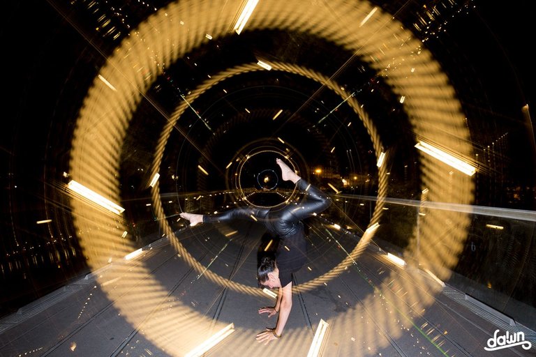
Here's my submission, please give me your feedbacks guys and don't hesitate to ask anything you want about it :

0.00022841 BEE
You are viewing a single comment's thread:
I think this is a great initiative @friendlymoose.
Here's my submission, please give me your feedbacks guys and don't hesitate to ask anything you want about it :

Hello, I leave my opinion.
Creativity and technique used for the desired purpose = Perfect.
Framing, the line of flight and the circular movement of the model following the effect = Perfect.
Colors? If there were more colors it would help a lot. Given that it's just one, orange-yellow from the flash with external light ruins it (in my opinion).
So, I edited in black and white. It would eliminate the "defect" of light and it would become more attractive, more subjective. It would take longer to understand the image, which would make it more enigmatic.
I took the liberty of doing a simulation that I attach. To imagine yourself you have to experience it.
Hello @cryptoreforma,
Thanks for your feedback :)
It obvious that I didn't use the flashgun the best way, it lit the floor and I agree it really unaesthetic.
Concerning colors : I usually use complementary colors. For that picture, I would use light-blue. But I had no extra tripod nor extra flashgun to put a colored gel on it and make a light-blue backlight. Next time I'll manage to fix that for sure.
Usually I'm not a big fan of B&W in lightpainting but it gives something different to the picture and I works for sure.
View more
It's a bit difficult to give tips as I don't know exactly what I'm looking at and also not what was possible in the situation.
First of all, I like the idea and the pose of your model is cool. It would be nice when she would have been a bit more inside the tunnel (but I don't know if that was possible).
If you would have chosen a different background color or a different color for the outfit, your model would stand out a bit more. But again; I don't know if that was possible in your situation.
My bad, I forgot to give infos @friendlymoose.
Here are the specs : 85s 16mm f/5.6 100 ISO
This picture is a lightpainting picture created in real time, captured to the camera in one single photographic frame. I do not edit my pictures (No layers /no Photoshop / no editing except minor adjustments (lens correction profite, WB, contrast (+12)) and addition of my logo.)
I made this picture at a pedestrian bridge. This is one of my kinetic approaches in lightpainting : I mean I use lights in the environment and I make my camera rotate on its axis using a "camera rotation tool". I cap/uncap the lens to capture only what I want to. This technique can look to be a "lazy" approach of lightpainting but it's trickier than it seems, especially when you want to place someone into that composition.
Here is the process : I first used a flashgun to lit Amelia, then I capped the lens and she left the frame. After that, I uncapped the lens and I started to do my job (capping and uncapping the lens while rotating the camera and pulling the zoom). When I felt I made enough, I ended the long exposure.
As I told to @cryptoreforma, a light-blue backlight would have been great but I wasn't able to do it on the moment.
View more
omg so good performed and designed idea for the amazingly turned out shot !
!PIZZA
thank you so much @victorbz :) :)
View more
For me it looks a bit to busy, a lot is happening here. But I really like it that the model is in those circles and that there are circles behind here. That's really awesome. But then I am not sure what kind of movements you made with the light but it looks like there is no consistency. About the flash, do you use a portable flash? I would light the model from below, pointing the flash up so that the pavement is not so visible. That is distracting me a little bit. I hope that you can do something with this comment. 👍
Hi @haastrecht,
First of all thanks for your feedback :)
As I explained on the previous answers, I made no movements with the light : I made my camera rotate on its axis using a rotation tool and I used city lights to draw my background. I don't understand when you say that "there is no consistency" : I worked with
concentric circles to give a feeling of depth and I took a lot of care for my model's placement during the making. Can you tell me more about it?
I'm not used to work with a flashgun so I did wrong with it. I'll try to place it on the floor next time, and to come with a sidekick to make it easier ;)
View more