LeoFinance Full – Scale Rebuild: Home Page Proposal
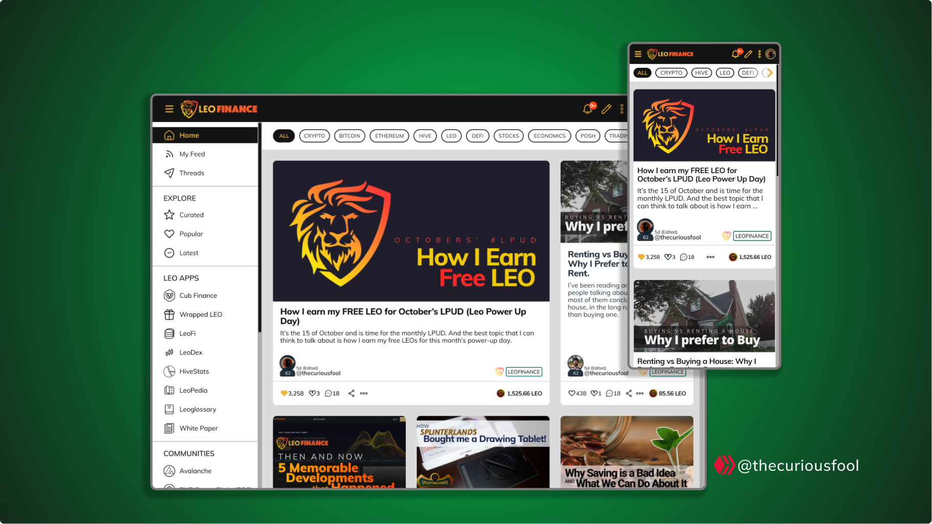
Here is my simple proposal for LeoFinance Redesign.
I consider LeoFinance as one of my home community and the upcoming full-scale rebuild gives me the perfect opportunity to showcase my design skills and pitch in my recommendations.
This is not a complete website design but rather focused on the home page. The home page plays a very important role as it is the face of the community. It can either make or break the user experience.
It is like our living room, as a community, it is where we present our ideas, findings, etc., to each other. It is also the first place we would ask our visitors to sit and present them with what we can offer. Thus, it is very important that much attention would be given to it.
I did make some changes but not to a point where it is unrecognizable from the current look of our home page.
I initially thought of presenting a Wireframe Diagram (UX) as I know that there would be iterations for sure, but finally decided on finishing the UI as most users would not appreciate a colorless presentation. 🙂
Note: All images are enlargeable. Right click on it and select 'Open in new tab' to fully inspect it.
What the heck did I do to the Home Page?
As can be seen already, I transferred the most of buttons from the title bar into one drawer menu.
I also made a space where we can advertise the LeoThreads on the home page itself.
| My Design Proposal |
|---|
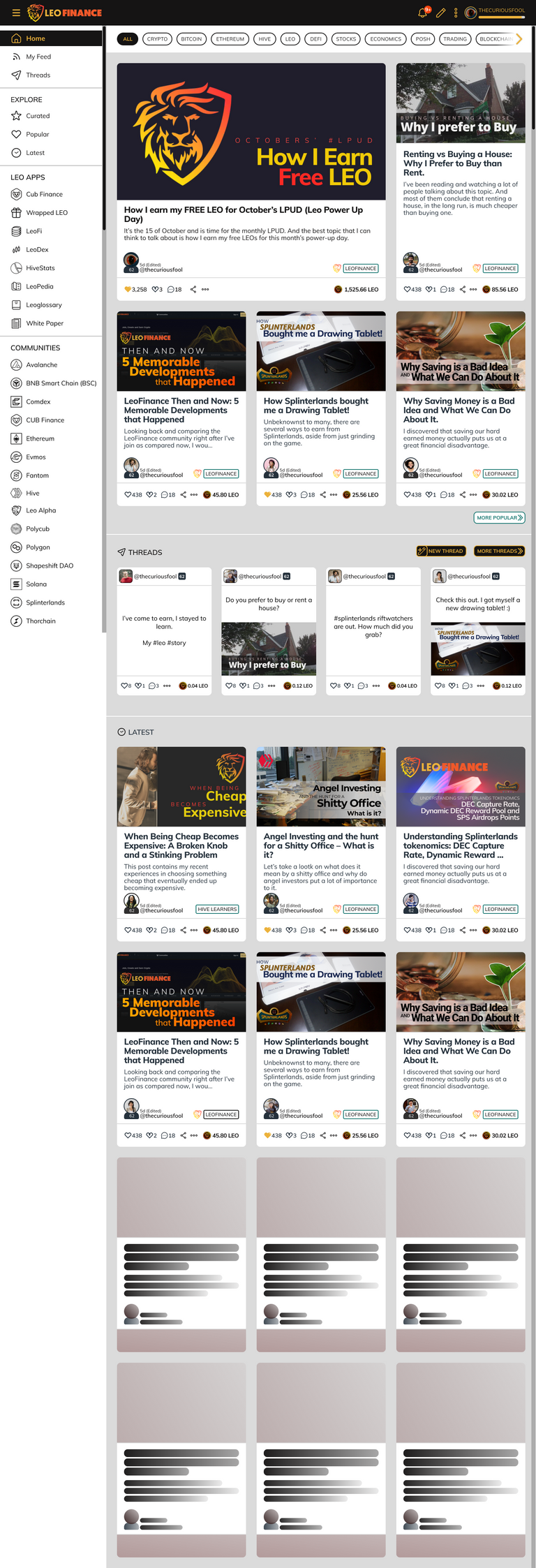 |
1. Brand Colors on the Title Bar
One thing that I wanted to be retained even if the user would switch to 'light/day mode' is the branding colors on the title bar. (see my design above)
| Current : Title Bar on light mode |
|---|
 |
2. Re-arranging How Posts are Displayed
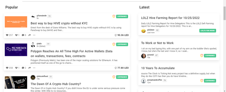
I re-arranged how the popular posts and latest posts are being displayed. Instead of the current version where the popular posts and the recent posts are displayed side by side, I find it cleaner and easier for the eyes if we displayed them one after the other. This way, two post or more at the same time will not fight for the attention of the viewer. (see my design above)
| Current : Popular and Latest posts being displayed side by side |
|---|
 |
If you notice, I removed the curators pick from being displayed from the home page. I removed it from my design as we can find it anyway under the 'popular' category. But we can definitely put those back. 😊
3. The Drawer Menu
All menu buttons that will take the user to another page are placed on a left drawer menu. These are the buttons that will immediately take the user on a click or a tap.
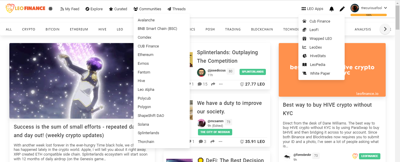
I also made it a way that the list of Leo Apps and Community Pages are visible to the user. In my experience, it took me time to find these out as they are wrapped (hidden) on a drop-down menu. (see my design above)
| Current : Drop Down menus for Leo Apps and Community Pages |
|---|
 |
Other menu buttons that are user-specific and settings are right on the title bar. This includes the notification and the ‘create a post’ buttons/icons.
4. A Loading Post/Article Icon
I find it nice if we have a loading post/article icon for posts that are still being loaded to the page. This would be a good indication that a series of post is currently being loaded as we scroll down the page. (See the most bottom part of my design proposal)
5. The Mobile Version
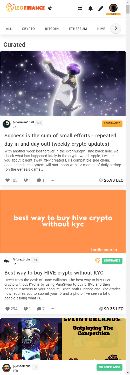
The mobile version of the homepage will have the drawer menu closed by default to give space for the list of posts/threads.
| Current : A screenshot of the mobile version |
|---|
 |
Proposed Mobile Design
| Default - Drawer Closed | Drawer Opened |
|---|---|
 |  |
5. Threads on Home Page
I initially thought of not adding this on the homepage but after attending one of the AMAs’ on @leofinance, I realized that it is better to integrate it into the home page.
In a way, LeoThreads is similar to YouTube shorts and Facebook stories/messenger. I believe that it would be great for LeoThreads to have its own separate mobile app but we cannot separate it from the main app. (see my design above)
Note: There are 3 ways to access the Threads page from the home page. These are from the 'create post' from the title bar, from the threads section within the body, and from the drawer.
The placement of LeoThreads on my design is inspired by YouTube shorts. I placed it after the top 5 most popular posts but we can also place the threads section on top.
I would love to hear your thoughts about it.
7. Compose Thread on Home Page
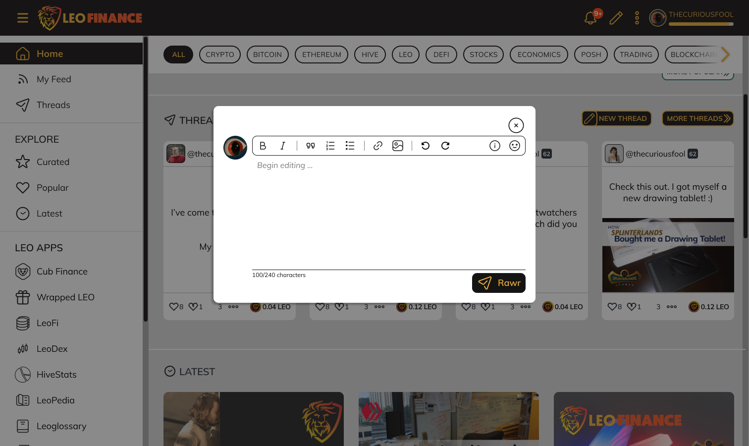
Another functionality that I added to my proposed design is the ability of the user to create a thread within the home page itself. I thought that it would be cool if we have that option. 😊
| A thread can be started by clicking on the 'New Thread' button |
|---|
 |
8. Notification Popup Menu
One of the things I wanted to be implemented is the ability to check the notifications without leaving the page. The current notification button, when clicked, makes you leave the current page you are viewing.
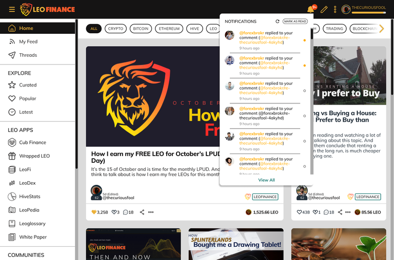 |
For me, there are times that I just wanted to check my notifications while scrolling content on the home page or reading content. From then, I would decide if I would read the notification immediately or later.
There are also notifications where the purpose is to simply notify you – like @leo.voter giving your post a juicy upvote or if your post has been re-blogged. We normally don’t want to visit the notification page for that.
The notification style I adapted is from PeakD.
9. Create a Post/Thread Popup Menu
For consistencies sake, the ‘compose’ or ‘create a post’ menu can also be implemented as a popup menu. This is a good option if we wanted to put a ‘create a thread’ under it.
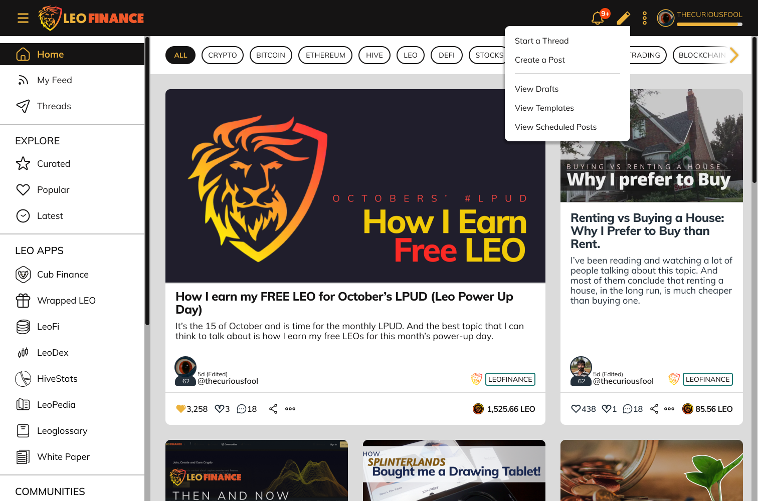
Aside from consistency, every time a user would create a post, he/she will be prompted to start a thread and vice-versa.
Again, this was inspired by PeakD.
Closing Thoughts
Most of the design consideration that I implemented on my home page design is limited by my personal experience using the different Hive community front-ends or sites. This includes my personal experience with other popular social media sites.
Thus, I would love to hear your thoughts on my output. Any feedback or input from you would be gladly appreciated.
I will be working next on the other pages such as threads, creating a post and leoglossary. Any support from you would inspire me more to give my best on my next work.
Thank you and more power.
Have a great day ahead.
Logo/Images/Icons/Screenshot Sources:
Community pages logos and icons were taken from the LeoFinance community pages. I had to redraw some of them for consistency sake. I was not able to redraw them all as my redrawing skill is currently limited.
All other icons were taken from Leo apps pages and from free icons within the Figma community.
- Universal Icon Set – V1.1 (Community) by FTDesign - Fintech UIkit
- Huge Icon Pack | 3,000+ Icons Set by FTDesign - Fintech UIkit
Profile Photos where also provided by the Content Reel plugin from Figma.
The LeoFinance logo is taken directly from LeoFinance.
Accompanying screenshots were also taken from LeoFinance.
Posted Using LeoFinance Beta

This is amazing contribution, you've paid a lot of attention the landing pages. I think differentiating the popular posts and new posts is good, I like to say some of the these tweaks can also be moved to the mobile version as lack of these features will keep people glued to the web version. Well-done. Nice work.
Thanks a bunch for appreciating my work.
Good thing you mentioned about the native mobile app, there is something I forgot to add on the home page to make the login easier. Anyway, I will add it on my next design / feature suggestion. 😊
In addition, I think I read somewhere that the number of our web users are much greater than the mobile users. As far as I know, generally, most users are now on mobile. Just imagine the potential of increasing more than 2x our current users via the mobile app.
!PGM !PIZZA !CTP
BUY AND STAKE THE PGM TO SEND A LOT OF TOKENS!
The tokens that the command sends are: 0.1 PGM-0.1 LVL-0.1 THGAMING-0.05 DEC-15 SBT-1 STARBITS-[0.00000001 BTC (SWAP.BTC) only if you have 2500 PGM in stake or more ]
5000 PGM IN STAKE = 2x rewards!
Discord
Support the curation account @ pgm-curator with a delegation 10 HP - 50 HP - 100 HP - 500 HP - 1000 HP
Get potential votes from @ pgm-curator by paying in PGM, here is a guide
I'm a bot, if you want a hand ask @ zottone444
This is actually brilliant. Love the attention you’ve paid to all the details. The drawer menu encompassing everything is a great idea. I also love what you did with the threads. Everything looks great 👍🏾
Posted Using LeoFinance Beta
Thank you for liking what I did and for leaving an encouraging comment. 😊
!PGM !PIZZA !CTP
i actually really like this design
Posted Using LeoFinance Beta
Thank you. I will work on the same theme for the other pages. 😊
!PGM !PIZZA !CTP
BUY AND STAKE THE PGM TO SEND A LOT OF TOKENS!
The tokens that the command sends are: 0.1 PGM-0.1 LVL-0.1 THGAMING-0.05 DEC-15 SBT-1 STARBITS-[0.00000001 BTC (SWAP.BTC) only if you have 2500 PGM in stake or more ]
5000 PGM IN STAKE = 2x rewards!
Discord
Support the curation account @ pgm-curator with a delegation 10 HP - 50 HP - 100 HP - 500 HP - 1000 HP
Get potential votes from @ pgm-curator by paying in PGM, here is a guide
I'm a bot, if you want a hand ask @ zottone444
I like this. I like this a lot.
Posted Using LeoFinance Beta
Thanks much for the positive feedback. 😊
!PGM !CTP !PIZZA
Your proposal looks lit bro. 🔥🔥
Loved it!
Posted Using LeoFinance Beta
Thank you. I am glad that you like it too. 😊
!PGM !PIZZA !CTP
Very good job!
!LUV
Posted Using LeoFinance Beta
@katerinaramm(1/1) gave you LUV. tools | wallet | discord | community | <>< daily
HiveBuzz.me NFT for Peace
Thanks a lot! 😊
!PGM !PIZZA !CTP
BUY AND STAKE THE PGM TO SEND A LOT OF TOKENS!
The tokens that the command sends are: 0.1 PGM-0.1 LVL-0.1 THGAMING-0.05 DEC-15 SBT-1 STARBITS-[0.00000001 BTC (SWAP.BTC) only if you have 2500 PGM in stake or more ]
5000 PGM IN STAKE = 2x rewards!
Discord
Support the curation account @ pgm-curator with a delegation 10 HP - 50 HP - 100 HP - 500 HP - 1000 HP
Get potential votes from @ pgm-curator by paying in PGM, here is a guide
I'm a bot, if you want a hand ask @ zottone444
I gifted $PIZZA slices here:
thecuriousfool tipped ifarmgirl-leo (x1)
thecuriousfool tipped josediccus (x1)
thecuriousfool tipped gwajnberg (x1)
thecuriousfool tipped elisonr13 (x1)
thecuriousfool tipped tengolotodo (x1)
thecuriousfool tipped atyourservice (x1)
thecuriousfool tipped bitcoinflood (x1)
thecuriousfool tipped geelocks (x1)
thecuriousfool tipped l337m45732 (x1)
gwajnberg tipped thecuriousfool (x1)
@thecuriousfool(4/10) tipped @cescajove (x1)
thecuriousfool tipped katerinaramm (x1)
thecuriousfool tipped mistakili (x1)
thecuriousfool tipped jerrythefarmer (x1)
Learn more at https://hive.pizza!
I love these! Very well-thought of and it's really cool how you put them altogether. Having the drawer on the left side would be great and re-arranging how the posts appear is simply awesome.
!CTP
Posted Using LeoFinance Beta
Thank you for liking my work and for the heart warming comment. 😊
I am being more encouraged to do the other pages. 🙂
!PGM !CTP !PIZZA
YW and go for it! Your front page proposal is awesome!
And keep on with the happy dance, haha!
Posted Using LeoFinance Beta
I liked the notifications changes best. Nice one
Posted Using LeoFinance Beta
Thank you. I'm glad you liked what I did with the notifications.
!PGM !PIZZA !CTP
Actully pretty dope design! Well done and great work putting so much effort into it.
Posted Using LeoFinance Beta
Thank you.
It took me time to make it, but I did enjoyed the process. 🙂
!PGM !CTP !PIZZA
BUY AND STAKE THE PGM TO SEND A LOT OF TOKENS!
The tokens that the command sends are: 0.1 PGM-0.1 LVL-0.1 THGAMING-0.05 DEC-15 SBT-1 STARBITS-[0.00000001 BTC (SWAP.BTC) only if you have 2500 PGM in stake or more ]
5000 PGM IN STAKE = 2x rewards!
Discord
Support the curation account @ pgm-curator with a delegation 10 HP - 50 HP - 100 HP - 500 HP - 1000 HP
Get potential votes from @ pgm-curator by paying in PGM, here is a guide
I'm a bot, if you want a hand ask @ zottone444
Yep for me this is an evolution
!PIZZA
!LUV
@gwajnberg(1/1) gave you LUV. tools | wallet | discord | community | <>< daily
HiveBuzz.me NFT for Peace
Thanks a bunch.
Really appreciate your appreciation. 😊
!PGM !CTP !PIZZA
Oh boy, I love the detail that you have put into this and your thought process too!
Really is a great design and I love the drawer!
!PGM
Posted Using LeoFinance Beta
BUY AND STAKE THE PGM TO SEND A LOT OF TOKENS!
The tokens that the command sends are: 0.1 PGM-0.1 LVL-0.1 THGAMING-0.05 DEC-15 SBT-1 STARBITS-[0.00000001 BTC (SWAP.BTC) only if you have 2500 PGM in stake or more ]
5000 PGM IN STAKE = 2x rewards!
Discord
Support the curation account @ pgm-curator with a delegation 10 HP - 50 HP - 100 HP - 500 HP - 1000 HP
Get potential votes from @ pgm-curator by paying in PGM, here is a guide
I'm a bot, if you want a hand ask @ zottone444
Thank you.
I am actually waiting for someone to point out some possible tweaks. But I am glad that it is receiving positive feedbacks. 😊
!PGM !CTP !PIZZA
BUY AND STAKE THE PGM TO SEND A LOT OF TOKENS!
The tokens that the command sends are: 0.1 PGM-0.1 LVL-0.1 THGAMING-0.05 DEC-15 SBT-1 STARBITS-[0.00000001 BTC (SWAP.BTC) only if you have 2500 PGM in stake or more ]
5000 PGM IN STAKE = 2x rewards!
Discord
Support the curation account @ pgm-curator with a delegation 10 HP - 50 HP - 100 HP - 500 HP - 1000 HP
Get potential votes from @ pgm-curator by paying in PGM, here is a guide
I'm a bot, if you want a hand ask @ zottone444
This is awesome!
I love those rearrangements and amazing features ...now it looks much cooler and advanced.. I came in from dreemport.
Posted Using LeoFinance Beta
Thank you.
I am working on some of the other pages and this kinds of comments is inspiring. 😊
!PGM !CTP !PIZZA
Sure!
Your work needs to be appreciated of course🤗
Hombre sí, la propuesta está rebien! Los menús desplegables son realmente útiles y necesarios en versiones web y Mobil; que cada menú contenga las herramientas fundamentales es perfecto. Y visualmente todo luce genial. Tienes el toque!! 🙏
Thanks a lot.
I appreciate you visiting and giving your feedback. 😊
!PGM !CTP !PIZZA
BUY AND STAKE THE PGM TO SEND A LOT OF TOKENS!
The tokens that the command sends are: 0.1 PGM-0.1 LVL-0.1 THGAMING-0.05 DEC-15 SBT-1 STARBITS-[0.00000001 BTC (SWAP.BTC) only if you have 2500 PGM in stake or more ]
5000 PGM IN STAKE = 2x rewards!
Discord
Support the curation account @ pgm-curator with a delegation 10 HP - 50 HP - 100 HP - 500 HP - 1000 HP
Get potential votes from @ pgm-curator by paying in PGM, here is a guide
I'm a bot, if you want a hand ask @ zottone444
Great proposal. Retaining the colours is good, I do love the colours on the home page. The mobile version is beautiful, makes the home page looks more structured. The notification part is what I love the most, we might always not want to read all notifications and just able to view the notifications without leaving your current page is helpful. This is a great proposal.
Came via dreemport
Posted Using LeoFinance Beta
Thank you for visiting and giving your feedback.
Let's hope we would see the notification be implemented as a popup menu. 😊
!PGM !PIZZA !CTP
BUY AND STAKE THE PGM TO SEND A LOT OF TOKENS!
The tokens that the command sends are: 0.1 PGM-0.1 LVL-0.1 THGAMING-0.05 DEC-15 SBT-1 STARBITS-[0.00000001 BTC (SWAP.BTC) only if you have 2500 PGM in stake or more ]
5000 PGM IN STAKE = 2x rewards!
Discord
Support the curation account @ pgm-curator with a delegation 10 HP - 50 HP - 100 HP - 500 HP - 1000 HP
Get potential votes from @ pgm-curator by paying in PGM, here is a guide
I'm a bot, if you want a hand ask @ zottone444