New Battle Screen

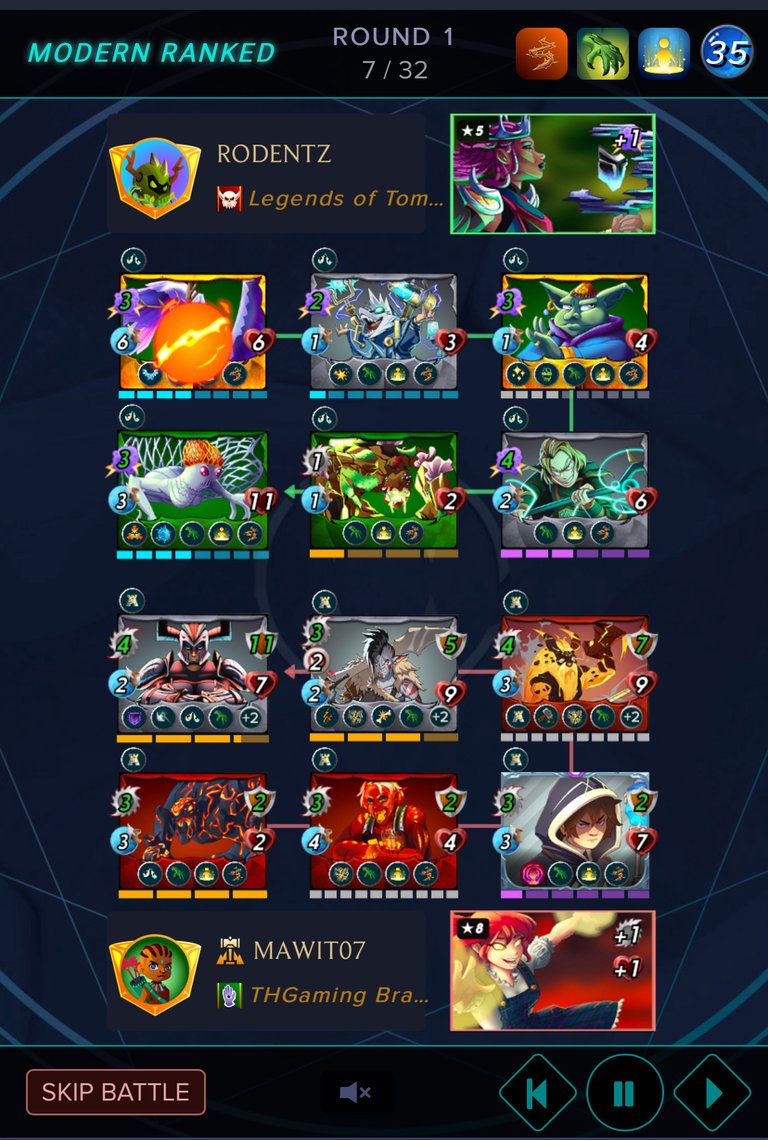
The game got a facelift on the battle screen. I have read how others felt about the new update. Some like the updates while others did not. For me I very much feel great with the new updates. The battle screen now fits perfectly on mobile phones but I am not sure how it looks on computer.
The cards are clear and stats are shown within the mobile screen without players having to scroll like past setup. In addition text such as opponent’s name and guild in addition to modern or wild battle is listed clearly. The matches seem to run smoother too.
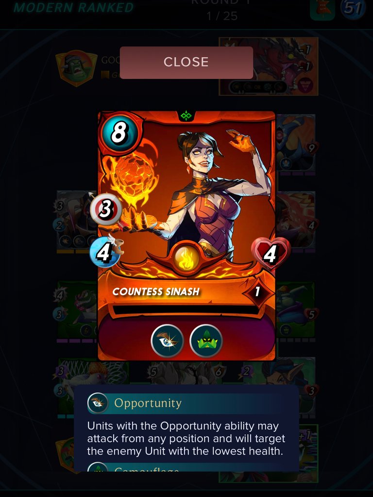
Clicking the cards to see individual stats are much better than the past. New pop up screen listing stats of card to review and closing out once done would not let players miss a beat with the battle.


The screen icon links are easy to spot on mobile and this avoids accidental clicks to happen like the infamous surrender button once match is setup.
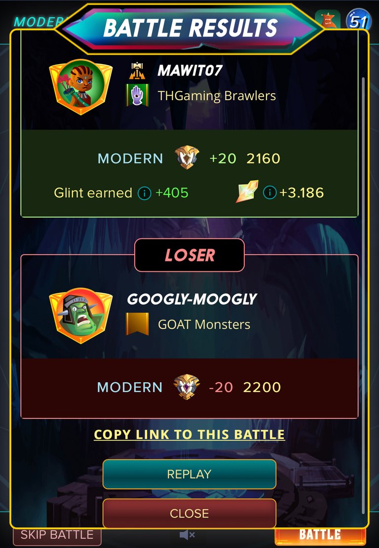
Overall I like the update as it fits well to mobile players. Screen refresh is fast and imagines definitely look modern compare to the past setup. I am still playing daily and with the new setup it motivates me to ply more.
Until next time thanks for reading!!!

I have plenty of other cards for rent! Just go on peakmonsters and check out the market place and if you are curious what I offer here is a link:
If You have yet to take part in playing this great game called Splinterlands please click on my referral link. It is free but in order to earn real assets such as cards and token you would have to invest in a starter deck or purchase game cards. Join the discord to learn more. Good luck!

THANKS FOR READING! CONTINUE TO PLAY SPLINTERLANDS!


I saw the new battle screen yesterday, but I kind of prefer the old one more. I play on my laptop and I just liked the old feel of it from before. I don't hate the new screen though.
Images fit nicely on mobile and I like it that way. Hope in the future they can allow users to select whether play with mobile or desktop options.
Delegate Tokens and HP to Fallen Angels to earn weekly rewards!
Delegate | Join to the guild